

A shop front has a few seconds to tell a passer by what is inside, and most of that work falls on the sign. These shop sign design ideas are written for a shop owner or brand manager in Saudi Arabia who is opening a new branch, taking over a unit or refreshing a front that has grown tired. The ideas are grouped three ways: by the kind of sign, by the trade behind the door and by the street the sign has to face. Each one comes with what it needs to work and the mistake that usually spoils it.
Read the section on types to see what is possible, the section on trades to see what suits your shop, and the section on the street before you approve any drawing. Cost is left out here on purpose, because it follows the type, the lighting, the materials and the height of the installation, and the only honest answer is a quote itemised line by line.
Shop sign design ideas by type of sign
Most fronts that work carry one main sign and one supporting piece. The main sign sets the tone of the whole facade, so choose it first and then choose what supports it.
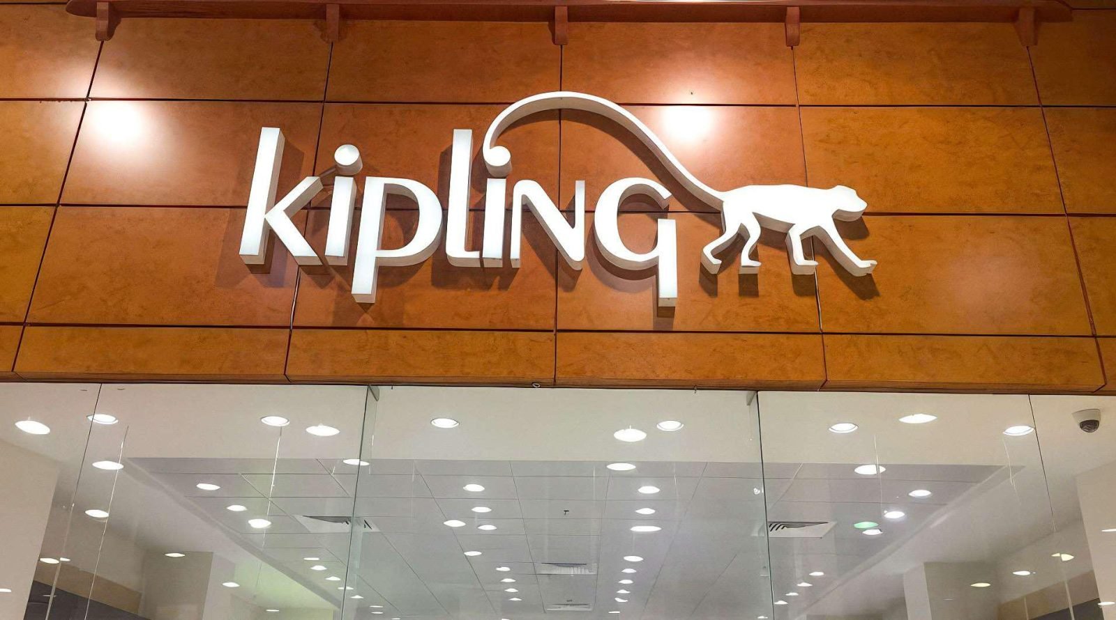
- Raised letters on the wall. Flat cut letters in acrylic, metal or painted board, fixed with a small gap off the wall so each one throws a thin shadow behind it. The idea suits a clean, light facade and a brand with a strong wordmark. It needs a wall smooth enough to show the shadow and a logo whose strokes are thick enough to cut. Avoid it on a facade crowded with joints, vents and holes left by an old sign: the letters get lost there, and a backing panel in the brand colour serves better.
- Halo lit letters. The face of each letter is opaque, often metal, and the light spills from behind onto the wall, drawing a soft ring around every character after dark. It is the quiet, premium choice for fashion, perfume and clinics. It needs a pale, even surface behind the letters, enough depth for the light to spread and a short name. Avoid it on dark cladding or rough stone, which swallow the glow, and avoid long slogans, which turn into a chain of rings nobody can read.
- A light box with a cut face. Instead of a rectangle that glows all over, the face of the light box is dark and only the logo and the name let light through. By day it reads as a coloured panel, at night as lit letters. It suits a busy street, a shop that may rebrand and a wide frontage on a careful budget. It needs a face material that stands up to outdoor sun and a box deep enough to spread the light evenly. Avoid a white face with a small logo, which after sunset becomes a glowing box with no name. For a way out of the rectangle altogether, a shaped box can follow the outline of the logo.
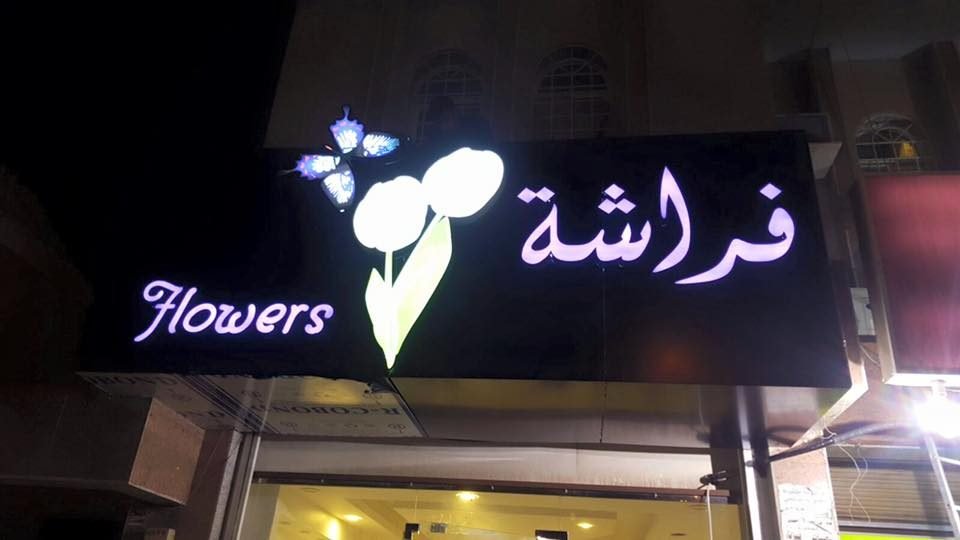
- Neon flex as a line, not the whole sign. A handwritten word, a short slogan or an outline drawn in neon flex, on the facade or hung inside the shop window. It gives a café or a dessert shop a warm, personal voice. It needs a drawing simplified to one continuous stroke, since a line of light cannot follow very fine Arabic calligraphy, and a clear or tinted acrylic back to carry it. Avoid making it the only sign on a fast road: a thin line reads beautifully from the pavement and poorly through a car window.
- A projecting blade sign. A double sided sign fixed at a right angle to the wall, so people walking along a row of shops see the name before they reach the door. In a covered arcade or an old market lane it often does more than the main fascia. It needs a solid fixing into the structure, safe clearance above people’s heads and both faces designed, since both are seen. Avoid copying the full fascia onto it: the logo mark alone, or a pictogram of the trade, reads faster.
- Window graphics. The glass carries the close range message: opening hours, services, a frosted band for privacy and a logo at eye level for whoever stands at the door. It is the easiest part of the front to change, so it suits seasonal offers and the opening weeks. It needs a clear rule for how much glass stays clear, because a window covered from edge to edge makes a shop look closed. Avoid repeating the main sign on the glass, and keep the window for what the fascia cannot say.
- A mall fascia under the tenant guide. In a mall the idea has to live inside the rules the mall issues to its tenants: the band where letters may sit, how they are lit and which fixings may show. Inside that frame there is still room for ideas: a recessed logo, a change of material at the entrance, a lit edge. It needs the tenant design guide before the first sketch and drawings the mall team can review. Avoid designing the version for the street and squeezing it into the band, since the mall usually sends it back.
Ideas by trade: what suits the business behind the door
Shop sign design ideas also change with the trade, since the same letters mean one thing over a café and another over a clinic. These are starting points by trade, each with the detail that usually decides whether the facade works.
- Café. A short name in halo lit or raised letters, with a neon flex word or a cup outline inside the window that people see from the street after dark. Where there is outdoor seating, the blade sign and the glass carry much of the load. It needs a warm light colour that matches the interior. Avoid a cold white glow, which makes a cosy café look like a pharmacy.
- Restaurant. Diners and delivery riders both look for the facade at night, often from a car, so the name has to be large in proportion to the facade, lit and in strong contrast with its ground. A light box with a cut face or face lit letters suits a main road. Write the name on the sign exactly as it appears on the delivery apps and on maps, so a rider can match the two at a glance. Avoid menu items and phone numbers on the main fascia; they belong on the glass and the door.
- Pharmacy. People look for a pharmacy in a hurry and often late, so the trade comes before the brand: the word pharmacy in both languages and a lit symbol people recognise from across the street. A projecting sign helps a great deal on a long street. It needs lighting that stays on through the opening hours and a symbol drawn cleanly enough to read from a distance. Avoid a stylish logo that hides what the shop is.
- Ladies salon. The glass of a ladies salon is usually frosted or covered for privacy, so the facade sign carries the whole identity on its own. A calm halo lit name, a neat frosted band with a pattern taken from the brand and a small sign at the entrance suit it well. It needs graphics that block the view completely and still look designed. Avoid photographs of faces on the glass; a pattern or the logo is safer and ages better.
- Boutique. Restraint reads as quality: a short name, metal or deep acrylic letters, halo light and nothing else on the fascia. The window display does the selling. It needs a smooth wall and fixings nobody sees. Avoid a bright light box, which pulls a fashion front toward the look of a grocery.
- Clinic. Patients need to find the entrance and feel they can trust the place, so clarity beats decoration: the clinic name, the specialty in a word or two and a frosted band on the glass that keeps waiting patients out of view from the street. A wayfinding panel at the building entrance helps when the clinic is on an upper floor. Avoid long lists of services on the facade; they belong inside and on the website.

Designing for the street: reading distance, day and night, two languages
A drawing on a laptop is seen up close and from a perfect angle. The street sees the same sign from a moving car, from the far pavement and from the door of the shop next to yours. Three checks decide whether shop sign design ideas survive the move from the screen to the street.
Reading distance
Find the nearest busy point the sign is seen from: the far side of a main road, a car park, the pavement or a mall concourse. The farther that point is, the fewer words the sign can carry and the more empty space each letter needs around it. A practical test: print the facade photograph with the proposed sign drawn on it, pin it to a wall, walk to the far end of the room and see what you can still read. Whatever disappears first, a tagline or a thin stroke, comes off or grows.
Day and night
By day the sign competes with sunlight, glare from the glass and the colour of the facade; at night it is often the clearest thing on the street. Ask for both views of the design drawn on the facade photograph. Mirror stainless steel looks rich in a showroom, but it reflects the street and the sky, so in strong sun it can read darker than the drawing, and a brushed finish or painted returns are calmer. Check which parts glow and which stay dark at night, because the night version is the one people photograph and share.
Arabic and English together
Most shop signs in the Kingdom carry the trade name in Arabic, and many set English beside it. The two scripts behave differently: Arabic runs from the right, joins its letters, and its dots and tails rise above the line and drop below it, while Latin capitals sit in a tidy band. Matching the two by letter height usually makes one look heavier than the other, so they are balanced by eye as one composition, with Arabic given its proper place. The municipality’s rules for commercial signs set how the two names may sit together, and they are revised from time to time, so read the current rules for your city on the Balady platform before the drawing is approved. A cut Arabic word is usually made as one connected piece, which is stronger and cleaner than separate letters assembled on the wall.
A quick checklist of shop sign design ideas
The table puts the types side by side so you can compare them before you ask for a drawing. Read the last column carefully: it is the one that saves a change after installation.
| Idea | Suits | Needs | Avoid |
|---|---|---|---|
| Raised letters on the wall | A clean facade and a strong wordmark | A smooth wall and thick logo strokes | A front crowded with joints and old marks |
| Halo lit letters | Fashion, perfume, clinics | A pale, even surface and a short name | Dark cladding and long slogans |
| Light box with a cut face | A busy street and a wide frontage | A sun resistant face and enough depth | A white face with a small logo |
| Neon flex | Cafés and dessert shops | A one stroke drawing and an acrylic back | Being the only sign on a fast road |
| Projecting blade sign | Rows of shops and covered arcades | A structural fixing and two designed faces | Copying the whole fascia |
| Window graphics | Offers, privacy, the opening weeks | A rule for how much glass stays clear | Covering the whole window |
| Mall fascia | Units inside malls | The tenant guide before the first sketch | Squeezing the street version into the band |
From idea to an approved drawing
An idea becomes a sign in a short run of steps, and most problems start with a step that was skipped.
- Photograph the facade. One picture of the facade straight on and one from the main approach, by day and after dark. Note what is behind the cladding if you know it, and where the power point is.
- Gather the brand files. The logo as vector files, the Arabic and English names exactly as registered, and the brand colours. If the logo exists only as an image, have it redrawn first through logo design, because cutting and lighting expose every flaw in a drawing.
- Shortlist two ideas, not five. Ask for each one drawn onto the facade photograph in a day view and a night view, since a choice between two is settled faster.
- Test the idea against the landlord’s rules. In a mall, test it against the tenant guide, before you grow attached to it.
- Freeze the wording before the licence. A word changed after the drawings are submitted sends the review back to the start.
- Ask for an itemised quote. Sign, lighting, installation and paperwork each on a line of its own, so offers can be compared on the same basis.
The licence and the mall’s rules
Every one of these shop sign design ideas still has to pass two approvals. The municipality issues the licence for a commercial sign on a street facade, and the landlord or the mall approves the sign as well, often with rules of its own. That is why the wording, the proportion of the sign to the facade and the lighting are settled before fabrication, not after. Our page on shop signage explains how we prepare the drawings and the application documents and follow the licence with you, while the decision stays with the municipality and the landlord. If your shop sits inside a mall, the article on what a mall requires before any display sets out the paperwork malls usually ask for.
Turning the idea into a facade with The Touch
Shop sign design ideas are only useful if they survive fabrication. At The Touch the sign is designed from your brand, cut and built in our own factory on CNC and laser machines, then assembled and lit there before it leaves, so an uneven glow is caught before it ever reaches the street. Our own team then installs it on the facade. The lit options, from light boxes with cut faces to halo lit letters, are explained on illuminated signs and light boxes, and raised letters and shaped pieces for the front or the interior on letters and shaped props. Neon flex is made in our own factory, bent to the drawn line.
When the sign is part of a whole new store, counters, display units and the interior can be handled together through retail fit out, so the front and the inside share one identity. A brand colour on acrylic and on print rarely matches by luck, and our article on print colour matching explains why. We have more than one location in the Kingdom; your sign is built in our own factory and installed by our own team, and where transport applies it is a named line in the quote. Send photographs of the facade and your logo files, and an itemised quote reaches you within 24 hours.
Questions about shop sign design
What is the best idea for a small shop front?
A small facade can carry one clear idea, not three. A short name in raised or halo lit letters, with tidy window graphics, is usually enough. If the shop sits in a long row, a projecting blade sign gives it a presence the narrow fascia cannot.
Halo lit or face lit letters: which reads better from the street?
Face lit letters read from further away, so they suit a main road and people passing by car. Halo lit letters are calmer and more premium, but they need a pale, smooth wall and a short name. Many fronts combine the two: the name with halo light and the logo mark lit from the front.
Should the sign be in Arabic and English?
The trade name in Arabic is the base, and most shops add English beside it. Design the two names as one composition balanced by eye rather than by letter height. Check the current municipal rules for your city on the Balady platform before the drawing is approved, because they set how the two names sit together.
Can a light box look premium?
Yes, if its face is dark and only the logo and the name let light through, or if the box is shaped to the outline of the logo instead of a rectangle. Then at night it reads as lit letters and not as a box. A white face lit all over is practical, but it rarely looks premium.
Does neon flex work outdoors in the Saudi climate?
Neon flex is a silicone strip lit by LED modules, so it runs at low voltage and has no glass. Outdoors it needs a type rated for exposed locations, sealed joints and a back that stands up to the sun. It still looks best as a supporting line close to people rather than as the only sign on a fast road.
What should I send to get shop sign design ideas for my facade?
Photographs of the facade, straight on and from the main approach, by day and at night, the shop address, your logo files and the name in both languages as registered. From there the idea is drawn onto the photograph of your own front. An itemised quote follows within 24 hours.
Do street front ideas work for a unit inside a mall?
Some do and some do not, because the mall’s tenant guide sets the band for the letters, the lighting method and what may show. Start from the guide and look for the idea inside it. There is still room there for a recessed logo, a lit edge or a different material at the entrance.
Signs From Our Factory
Photographed on site after handover, no renders.
Have a project and want a real number?
Send the area, the date and the city, and we come back with an itemised quote within 24 hours. No commitment, and no vague all-in price.

