
Print Colour Matching: Why Brand Colours Shift in Print
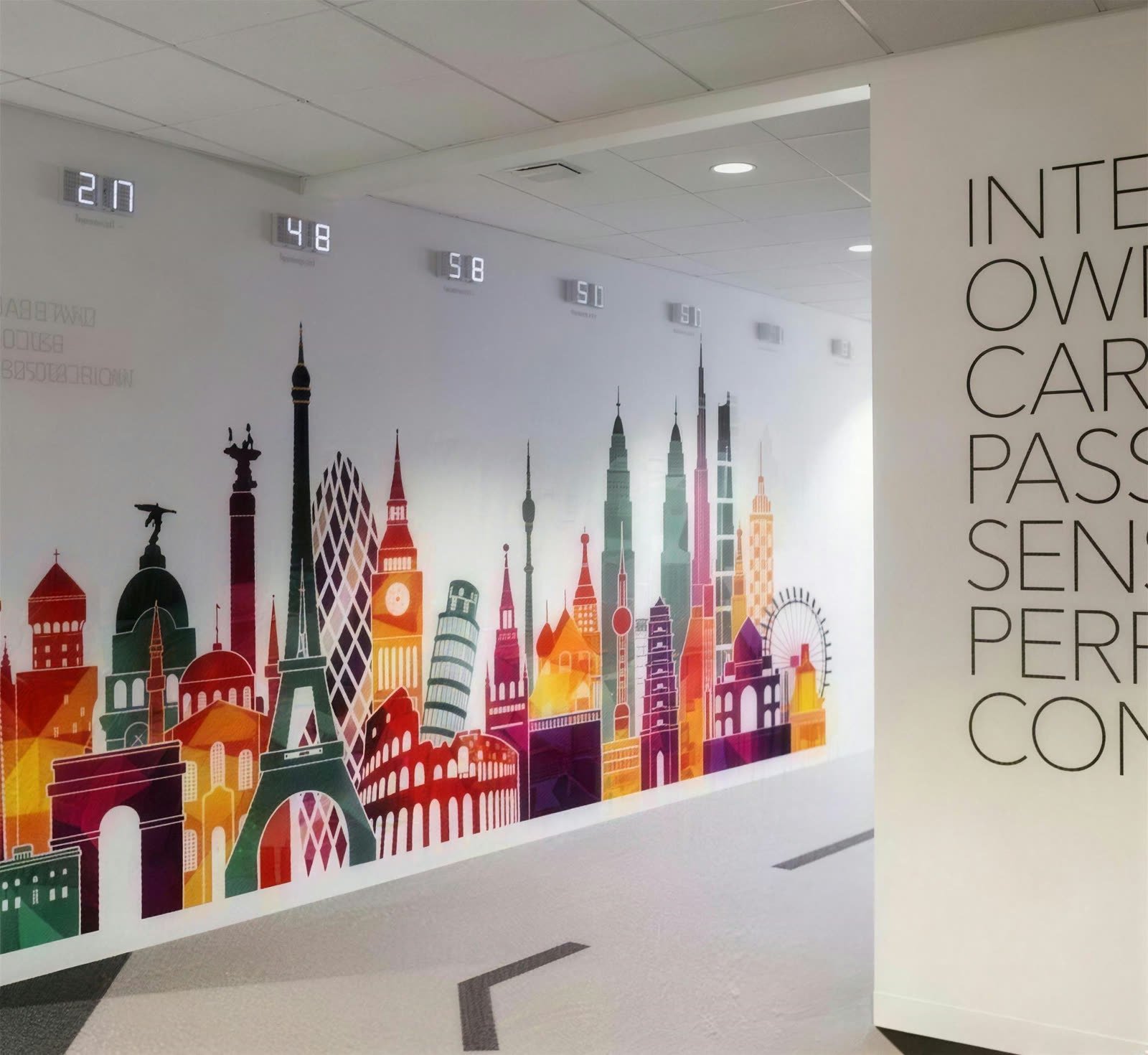
The identity is approved on screen, a clear warm purple, then the panel arrives at the show and the purple leans blue, the pink looks tired and the white is closer to grey. Nobody necessarily made a mistake. Most

