
Logo Design Company
Logo Design Company for a Mark That Reads in Both Scripts
A new company, a rebrand or a product line that needs a face of its own usually arrives with the same request: a bilingual logo in Arabic and English that looks as if it was born as one piece. As a logo design company we treat that as the real brief, not a detail to settle at the end. The Arabic is not typed in a default font under the English, and the English is not a caption under the Arabic. Both are drawn together, tried on a browser tab and on a shop front, then handed over as files that any printer, sign maker or developer can open. This page explains how the work runs, the kinds of mark you can choose from, and when a logo alone is not enough.
Why a Bilingual Logo Is Drawn, Not Translated
Many bilingual logos that look uneasy in the Saudi market were designed in one script and patched in the other. The fault is structural rather than a matter of taste, and it shows the first time the logo is enlarged onto a sign.
Opposite directions on one line
Arabic reads from the right and English from the left. In a horizontal lockup the symbol has to sit where both readings can start from it, or the eye crosses the mark back and forth before it settles. The reading order is decided with the first sketch, not when the files are prepared.
Skeletons and heights that do not match
Latin letters stand on a baseline, with capitals and a fixed height for the lower case. An Arabic letter changes shape with its place in the word, carries dots above or below, and some tails drop well under the line. The two words are balanced by their visual mass, not by setting them at the same size.
Weight that looks equal to the eye
A stroke that reads as medium in English can look heavy in Arabic, because Arabic letters join and sit closer together. In a bilingual mark, stroke thickness, the spaces inside the letters and the gaps between them are adjusted on both sides until neither word drowns out the other.
One character, each script's own tools
If the English is rounded and friendly, a sharp angular Arabic contradicts it. The character you choose, whether formal, warm, technical or playful, is expressed in each script with that script's own means, so a reader of either language comes away with the same impression.
Where the New Mark Goes After Approval
A mark is approved on a screen and judged in the street. These teams carry it into the real world under the same roof.
Printing & Promotional Gifts
Letterheads, stickers, packaging and giveaways printed with the approved colour codes. Graphics are printed in 1 to 5 working days once the artwork is signed.
Acrylic & Wood Fabrication
The logo cut in acrylic or wood for a reception wall, a counter front or a desk plaque, from the same vector master.
Promoters & Brand Ambassadors
Hosts with a supervisor for the day the new brand is introduced to clients, staff or visitors.
Branding & Creative Studio
The full visual identity when a logo is only the first piece: colour system, typefaces, photographic style and a brand guide.
Digital Solutions
Screen versions of the logo for the website header, the browser tab, the app store listing and event screens.
Experiences & Events
An unveiling for a rebrand or an opening, so the people who will carry the new logo understand why it changed.
Social Media & Content
Profile pictures, post templates and short clips that introduce the new logo to your followers.
Custom Exhibition Stands
The first stand to carry the logo, built into its walls rather than stuck onto them.
The Kinds of Mark You Can Choose From
Every logo belongs to one of a few families. The right family depends on your name, your sector and the place the logo will appear most. A good logo design company explains what each family gains and gives up before you choose.
Word mark
The company name itself drawn as custom lettering, with no separate symbol. It works when the name is short, distinctive and worth remembering exactly as it is. In a bilingual word mark both names are lettered, and their lengths decide whether they sit side by side or stacked.
Letter mark
Initials, or a single letter, turned into a compact sign. It helps when the full name is long or hard to pronounce in one of the languages. Arabic and Latin initials rarely share a shape, so a bilingual letter mark either picks a script or builds a form that reads in both.
Pictorial symbol
A recognisable image, such as a palm, a falcon, a drop or a building, simplified until it reads at a glance. It crosses languages easily, but every sector has its crowded images, and a symbol close to a competitor's invites trouble at trademark registration.
Abstract symbol
A shape with no literal meaning, built from a geometry, an ornament or a fragment of a letter. It is the most ownable family and the slowest to be recognised, because its meaning is learned through repeated use.
Combination mark
A symbol locked to the Arabic and English names in fixed arrangements: horizontal, stacked and the symbol alone. It is the usual choice for a new company, because once people know it the symbol can stand by itself on an app icon or a uniform.
Emblem
The name sits inside a frame, as in a seal, a badge or a crest. It suits heritage, education, clubs and government programmes. Its weakness is size: the inner text closes up quickly, so an emblem needs a simplified version for small uses.
How Our Logo Design Company Runs a Project
The stages are the same for a new name, a rebrand or a product line. What changes is the depth of research and the number of people in the decision.
The brief and the questions behind it
We ask what the company does and for whom, which qualities it wants to be known for and which it wants to avoid, who the competitors are, where the logo will appear most, whether the current logo holds anything people recognise, which language leads on signs, and who has the final word. Those answers set the direction more than any sketch.
Sector and competitor research
Before drawing, we gather the logos of your competitors and of neighbouring sectors in the Saudi market and sort them by colour, symbol and lettering style. The board shows which colours and images are worn out, where the whole sector looks alike, and the space your logo can claim for itself.
Concept routes
Each route is a separate idea, not the same idea in other colours. Every route is shown as a bilingual mark, Arabic and English together, black on white first, small and large, so its form is judged before colour sways anyone.
Arabic and English drawn side by side
Once a route is chosen, both names are developed together: the Arabic style is settled as calligraphic or geometric, stroke weights are matched, baselines and heights are aligned by eye rather than by measurement, and the spacing between the words and the symbol is fixed for every lockup.
Tested small, large, single colour and reversed
The mark is placed on a browser tab, an app icon, a business card and a shop front mock up, then printed in black only and reversed out in white on a dark ground. Whatever breaks at either end is corrected before the colours are approved.
Refinement, sign off and handover
Refinements are made with a single decision maker or a small panel named at the start. After written sign off you receive the file pack and a short usage sheet, ready for the printer, the sign maker and a trademark application.
How Long a Logo Takes
The quote
Within 24 hours of receiving the brief, with the stages and their dates set out.
Concepts and refinements
Depends on the research needed, how many people approve and how fast feedback returns. The quote states the date of each stage.
The first printed pieces
Stickers, letterheads and labels are printed in 1 to 5 working days once the artwork is approved.
The facade sign
Depends on the facade, the material and the municipal licence. The sign quote states the installation date.
What Shapes the Price of a Logo
As a logo design company we publish no price list, because a logo is priced from its brief rather than from a table. These are the factors that move the price, named so you can compare offers on the same basis.
A new name or a known one
A brand new company starts from a blank page. A rebrand starts with a review of what the current logo has earned in people's minds, and a refresh that keeps the familiar parts is a different job from replacing the logo outright.
Drawn lettering or an adjusted typeface
Setting the name in an existing typeface and refining it is faster. Drawing every Arabic and English letter by hand gives you a mark nobody else can buy, and takes longer at the drawing board.
How deep the research goes
A neighbourhood café and a company entering a crowded national sector need very different amounts of competitor review. The quote shows the research as its own line.
Who approves
A founder who decides alone moves faster than a board, a parent company and a marketing agency each commenting in turn. Naming the approvers early is the cheapest saving in any logo project.
A product line or a sub brand
A product logo has to stand beside the parent logo. Drawing that relationship, endorsed by the parent, sharing its symbol or fully separate, is work on top of the logo itself.
The file pack and the applications
Every logo comes with its master files and its usage sheet. Mock ups of signs, stationery, packaging or uniforms, and the licence for any commercial typeface inside the logo, are separate lines in the quote.
Send your company name in Arabic and English, a line about what you do, your current logo if there is one, and the places the logo will appear first. An itemised quote for your logo design reaches you within 24 hours. Request a quote or message 0567069088 on WhatsApp. If the new logo will make its first public appearance on a trade show stand, our guide to exhibition stand cost in Saudi Arabia explains how that budget is built.
After the Logo: Registration, Profile, Signs and Screens
A bilingual mark earns its keep when it reaches the places people meet your company. Trademark registration is filed by the owner with the Saudi Authority for Intellectual Property: we prepare the clean files and the versions the application asks for, and the filing and the decision stay between you and the authority. Search for similar marks in your class of goods or services before final sign off, not after it. Once approved, the logo usually moves into a company profile design for tenders and partners, and onto slides through our presentation design team. A conference or forum you host can have its own identity built around it on the event branding page. On a building, a shop or a reception, the facade and interior signs come from our signage company in Saudi Arabia, which prepares the municipal licence with you. Product labels and seals come from sticker and label printing, and the announcement on your accounts from social media content creation.
A Logo Alone or a Full Visual Identity?
A logo is the signature of a company. A full identity is the handwriting everything around it is written in. These questions, which any logo design company should put to you, show which one you need now.
How many places will carry it soon?
If the logo will appear this year on a sign, a website and a business card, a well built logo with its usage sheet is a sound start. If packaging, uniforms, vehicles, a stand and social accounts are all coming at once, a full identity saves you from inventing rules piece by piece.
Will several suppliers apply it?
When a printer, a sign maker, a web developer and an agency all work from the logo, they need colours, typefaces and layouts defined in advance. That is the brand guide of a full identity, and our branding and creative studio builds it.
Is it a rebrand of a known company?
A known company changing its face needs more than a new logo: the change has to reach every touchpoint at roughly the same time, or the old and new logos live side by side for years.
Is it a product line?
A new product usually needs its own logo and a packaging system tied to the parent brand, not a complete identity of its own.
Is the budget tight for now?
Start with a bilingual logo, drawn properly in both scripts and delivered with its file pack. A full identity can grow from it later, whereas a weak logo has to be replaced before anything can grow from it.
Logo Mistakes That Surface After Launch
Each one is easy to fix on the drawing board and costly once the signs are made.
Arabic typed under a finished English logo
The English is carefully drawn and the Arabic is set in a default font underneath. It looks borrowed, and on a facade where the Arabic name has to lead, the weakest part of the logo becomes the largest.
Stretching the Arabic to fill a width
Pulling the joining strokes long with kashida so the Arabic matches the English width distorts the word and reads as a shortcut. Widths are balanced through the arrangement and the letter design, not by stretching.
A mark that vanishes on a browser tab
Hairline strokes, small text and detailed symbols turn into a smudge at icon size. A logo needs a reduced form, often the symbol or an initial, drawn specifically for its smallest uses.
Colour doing all the work
If the logo only makes sense in its gradient, it fails on a black stamp, an engraved plaque, foil on a box and embroidery on a uniform. Approve the single colour version as seriously as the coloured one.
Reversed versions copied from the positive
Light shapes on a dark ground look bolder than dark shapes on a light one. A white logo on a dark facade often needs slightly thinner strokes, drawn as a file of its own.
Only image files handed over
A PNG sent in a chat is not a logo file. Without vector masters and lettering converted to outlines, every sign maker and printer redraws the mark their own way, and it drifts further from the original with each supplier.
Drawn and Produced Under One Roof
Here the logo design company and the factory are the same people. Design, CNC and laser cutting, joinery, paint, acrylic, large format print and installation are all done by our own teams under one roof, so the mark you approved on screen is checked against the letters and signs that will be cut from it. We have worked for Kinan, the Heritage Commission, Saudia Holidays, Johnson & Johnson MedTech, Cartoon Network, Ganache and Oceanera.
Design From Our Studio
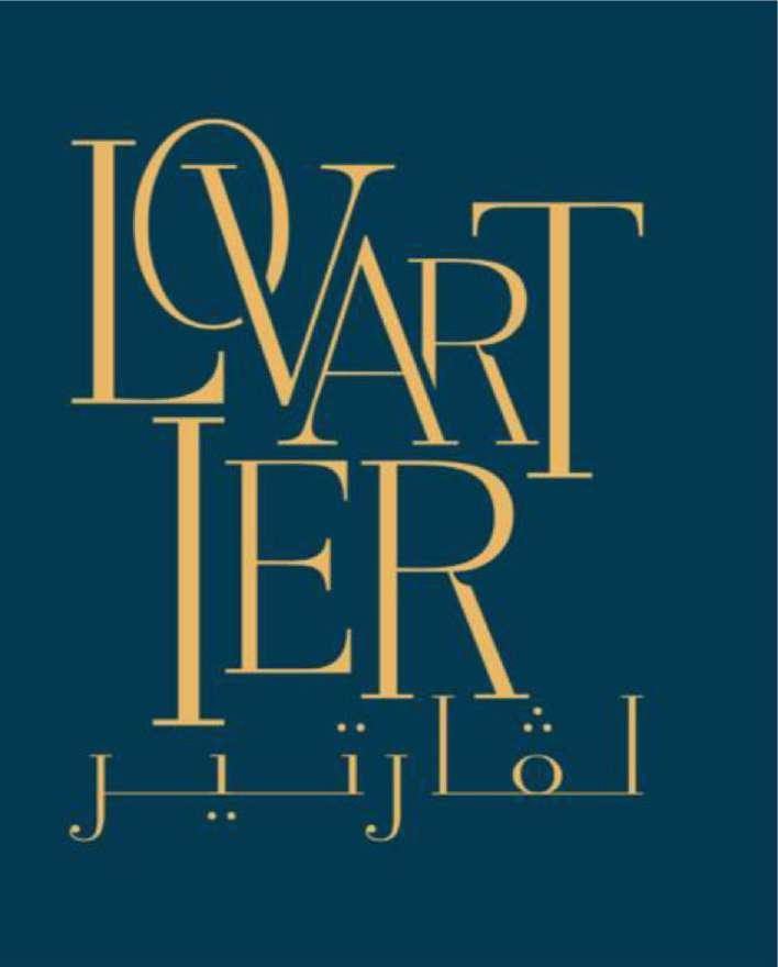
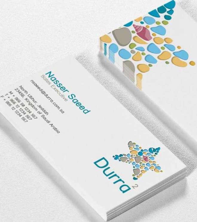
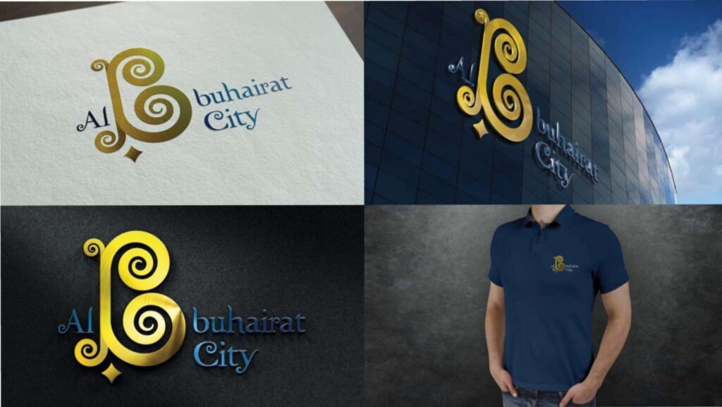
Identities, print and design work we delivered to clients.


Questions for a Logo Design Company
What owners and marketing managers ask a logo design company before they commission a mark.
What does a logo design company hand over at the end?
The approved logo in its Arabic, English and combined lockups, a symbol or initial for small uses, a single colour version and a reversed one, and colour codes for print and screen. It all arrives as vector masters with ready print and screen files, plus a short usage sheet.
Do you design the Arabic and English versions at the same time?
Yes. Both names are drawn together from the first concept, so their weight, height and character match. Adding the Arabic after the English has been approved is the most common reason a bilingual logo looks uneven.
Should the Arabic be calligraphic or geometric?
Arabic drawn from calligraphic styles such as Thuluth or Diwani carries heritage and elegance but becomes hard to read at small sizes. Geometric Arabic, often built on Kufi, stays clear when small and sits naturally beside modern English letterforms. The sector and the smallest use of the mark usually decide.
What will you ask us before designing?
What you do and for whom, who your competitors are, the impression the logo should give, where it will appear most, whether anything from the current logo should stay, which language leads on signs, and who signs off. A short call or a written brief covers it.
Which type of mark suits a new company?
A combination mark is the common start: both names and a symbol together, with the symbol able to stand alone later. A short, distinctive name may need only a word mark, and a long name often benefits from a letter mark.
Can you refresh our logo instead of replacing it?
Yes. We first review what your customers already recognise, such as a colour, a shape or the way the name is written, and keep it. Then we correct the bilingual balance between the Arabic and the English, the behaviour at small sizes and the quality of the files.
Do you register the trademark?
No. Registration is filed by the owner with the Saudi Authority for Intellectual Property. We prepare the logo files and the versions the application needs, and we advise a search for similar marks before the design is finally approved.
How long does a logo take?
It depends on the research needed, the number of approvers and the speed of feedback. The quote, sent within 24 hours of the brief, states the date of each stage.
Do we need a full visual identity or just a logo?
A logo with its file pack is enough for a company starting with a sign, a website and stationery. Once packaging, uniforms, a stand and several suppliers are involved, a full identity from our branding and creative studio is the better choice.
How do we start?
Send your company name in both languages, what you do, any current logo and where the logo will appear first, on WhatsApp at 0567069088 or through the quote page. We have more than one location in the Kingdom, and the signs and print that carry your logo are made in our own factory and installed by our own team.
A Logo That Works in Both Languages?
Send your name in Arabic and English and the place the logo will appear first. Within 24 hours you receive an itemised quote that names each stage of the bilingual mark, each test and each file you will receive.
More specific pages on this
If your question is narrower than this page, these are written for one question each.

