
Wayfinding Signage
Wayfinding Signage That Gets People to the Right Door
Wayfinding signage is the set of signs that takes a visitor from the car park or the main entrance to the clinic, hall, shop or office they came for, without stopping to ask anyone. In a hospital, a university campus, an office tower, a mall or an exhibition you host, it works as a system rather than a scatter of signs: directories at the entrances, a sign in the lift lobby of every floor, directional signs at each junction, overhead signs where crowds hide the walls, and identification at every door. This page explains how the system is planned from a walk of the building, how Arabic and English share it, what decides reading distance, contrast and materials, how signs are fixed, and how everything stays correct when tenants move.
Why Wayfinding Signage Is Planned as One System
Lost visitors cost a facility time and goodwill: missed appointments, staff stopped in corridors to give directions, guests arriving late and irritated. Buying directional signs one at a time cannot cure that, because the trouble lives in the gaps between one sign and the next.
Every junction is a decision
Someone walking through a building makes a chain of small choices: which entrance, which lift, which way out of the lobby, which corridor. Good wayfinding signage puts the right message at each of those decision points and nothing in between, so people meet a sign at the exact moment they need one.
A destination never drops off
If the cardiology clinic is named at the entrance, it has to appear again at every junction until the visitor reaches its door. When a destination vanishes from a sign halfway along, people assume they took a wrong turn and walk back. That continuity is what separates a system from a collection of signs.
One name for each place
The name on the directory, on the lift buttons, in the lobby of each floor, on the door, in the appointment message and on the website must be the same words. A department called one thing on the wall and another at reception sends people in circles, and agreeing the names costs nothing next to remaking signs.
Fewer questions at reception and security
Receptionists, guards and nurses spend a noticeable part of their day explaining the way. Clear directional signs give them that time back, and let a first time visitor move through the place with the confidence of someone who has been there before.
Alongside the Sign System
A new building, or a venue hosting an event, rarely needs signs alone. These come from teams working with us under one roof.
Printing & Promotional Gifts
Printed floor plans for the reception desk, vinyl for glass doors and lift lobbies, and paper maps for visitors. Graphics are printed in 1 to 5 working days once the artwork is approved.
Acrylic & Wood Fabrication
Sign trays, directory panels and door plates, with the CNC and laser cutting behind every piece in the system.
Promoters & Brand Ambassadors
Hosts with a supervisor who guide guests on the opening day of a building or through a busy conference, while visitors learn the signs.
Branding & Creative Studio
The Arabic typeface and its English partner, the arrow set, the pictograms and the zone colours, drawn once and used on every sign.
Digital Solutions
A screen directory in the main lobby, or a QR code on a sign that opens a map of the site on the visitor's phone.
Experiences & Events
The opening of a new campus, hospital wing or head office, planned and run by our events team.
Social Media & Content
Photos and short video of the finished building, ready for the announcement that it is open.
Custom Exhibition Stands
When your organisation exhibits, a stand designed, built and test assembled in our factory, then installed by our own team.
The Sign Family Inside Wayfinding Signage
Each sign type answers a different question at a different moment of the route. Sorting them by job rather than by material is the first line of any sign schedule.
Directory boards at the entrances
The first thing a visitor reads after the door: departments, tenants or halls, each with its floor, often beside a map of the site. A directory is read standing still, so it can carry more lines than any other sign, sorted the way people search, by name or by service, never by the management's internal codes.
Floor and lift lobby signs
When the lift doors open, the visitor wants to know where they are and which way to turn. A floor number on the wall facing the lift doors can be read from inside the car before stepping out, and a short floor directory beside it says what lies left and right. The same sign repeats at the stair door on every floor.
Directional and overhead signs
Arrows and destination names at corridor junctions, hung from the ceiling or fixed to a wall. Overhead signs stay visible above the heads of a crowd in a mall or an outpatient hall, where a wall sign disappears behind people. Each directional sign carries only the destinations reached through that junction, never the whole building.
Room and door identification
The sign that confirms arrival: a room number and name, a clinic, a lecture theatre, a tenant's office. It sits beside the door at the same height and on the same side on every floor, so after the first door a visitor knows where to look at the next.
Car park and approach signs
Vehicle signs at entrances, exits and ramps between levels, and pedestrian signs that lead drivers back to the lifts. Marking each level with a colour plus a name or a symbol helps people remember where they parked, and column signs along the driving aisle stay readable from behind a windscreen.
Accessible and temporary signs
Accessible routes, ramps and lifts are marked with the internationally recognised symbol, and tactile signs with raised letters and braille are added where the client asks for them. Temporary wayfinding for exhibitions, conferences and events relies on freestanding totems with weighted bases, hanging banners and floor graphics that stay for the event days and then come down.
How Wayfinding Signage Is Planned and Installed
Most sign systems that fail skipped the walk and went straight to design. When you compare wayfinding signage companies, ask each one whether they walk the building before they draw. These are our steps.
Walk the building and mark the decision points
Our team walks every route a visitor takes, from the car park and each entrance to the furthest room, with the floor plans in hand. Every point where someone must choose a direction is marked, along with the wall, ceiling or glass available there and whatever blocks the view, from columns to doors left open.
Agree the names and their ranking
Before any sign is drawn, the destinations are listed and named with the client, then ranked: major destinations are named from the entrance, while secondary ones appear only once the visitor is in the right zone or on the right floor. That ranking decides what each sign carries.
Design the family in Arabic and English
An Arabic typeface with a matching English partner, a single arrow, one pictogram set, a colour for each zone and a fixed rule for which language leads. Each sign type is drawn with its layout, its fixing and its position, and the drawings come to you for approval.
Build the sign schedule
Every sign in the building gets a code on the floor plan and a line in the schedule: type, location, the exact text in both languages, arrow direction, material, fixing and whether it is lit. The schedule is what production follows and what you check against at handover.
A sample of each type before the full run
A sample of each sign type is made and fixed in its real position, so you judge letter size from the actual reading distance, contrast under the building's own lights and the fixing on the real wall. The full quantity goes into production only after the samples are approved.
Production and installation
Signs are cut, printed and assembled in our own factory, then installed by our own team floor by floor against the schedule. You receive the schedule and the drawings at handover, so any later change starts from the right file.
What Sets the Date of a Wayfinding Project
The building's readiness
Signs go up after walls are painted, ceilings are closed and power reaches the lit pieces, so installation is timed around the fit out contractor's programme.
The size of the schedule
The number of sign types, how many are lit and how many floors and car park levels they cover set the production time. The quote states the date.
Approval of names and samples
The date counts from approval of the destination list and the samples, so a quick decision on names saves more time than anything else.
Printed and vinyl parts
Printed graphics and vinyl are ready in 1 to 5 working days once the artwork is approved.
What Decides the Cost of Wayfinding Signage
We publish no price list, because wayfinding signage is priced from its sign schedule. These are the lines that move the total, named so you can compare quotes against the same schedule.
How many signs, and how many types
Many copies of one floor sign cost less each than a building where every sign is a different design. A tight ranking of destinations keeps both the count and the variety under control.
Signs hung from the ceiling
Overhead directional signs need drop rods or cables, fixings above the false ceiling and work at height, often outside opening hours in a hospital or a mall.
Lit directories and signs
Backlit directories and lit signs in car parks add LED modules, drivers and wiring, and they need a power point the electrical contractor provides before the ceiling is closed.
Material and finish
Printed vinyl on aluminium panels is the economical end. Acrylic faces, cut letters, layered panels and paint matched to a brand colour each add material and hand work.
Parts made to change
Directory strips, slide in door inserts and removable panels cost more at the start, and they save the price of a new sign each time a tenant or a department moves.
Tactile, temporary and outdoor work
Tactile signs, freestanding event totems and outdoor signs that face sun and dust each need materials of their own, and they appear as separate lines in the quote.
Send the floor plans, your list of destinations if you have one, photos of the entrances and lift lobbies, and your logo files. An itemised quote for your sign system reaches you within 24 hours. Request a quote or message 0567069088 on WhatsApp. If your organisation is also exhibiting this year, our guide to exhibition stand cost in Saudi Arabia shows how a stand budget is built line by line.
Safety Signs, the Authority and Related Sign Pages
Fire exit signs, evacuation plans, assembly points and fire equipment signs are not among the design choices described on this page. Their content, symbols, colours and positions follow the civil defence rules, and the building's safety consultant or the authority sets the schedule for them. We produce those signs to the schedule they issue and fix them where it marks, and where exit signs must be lit, the emergency light fittings belong to the electrical contractor. Wayfinding signage sits beside other sign families on this site. Door plates, reception logos and office signs made in acrylic are on acrylic signage, and the full range from the facade to the meeting room is on our signage company in Saudi Arabia page. Lit directories and light boxes for car parks and lobbies are covered under illuminated signs and light boxes, and raised letters for a building name or a zone marker under 3D letters and props. Temporary wayfinding for a summit or a forum is part of the work of our conference organisers in Saudi Arabia, and signs that guide shoppers inside a store are planned with a retail fit out.
Arabic and English, Reading Distance and Contrast
These decisions are taken once for the whole of the wayfinding signage and then applied to every sign. Getting them right matters more than the choice of material.
Which language leads?
Most buildings in the Kingdom put Arabic first, on the right of the sign or above the English, and keep that order on every sign so the eye knows where to look. The two scripts are tuned to look equal in weight, and the English is never squeezed into whatever space the Arabic leaves.
Where does the arrow sit?
The arrow on a directional sign sits on the side it points to: a left arrow at the left edge, a right arrow at the right edge, with destinations grouped under their arrow so no line points two ways. An arrow pointing up means straight ahead, so stairs and upper floors are shown with a stair pictogram and the floor name, never with a rising arrow alone.
How tall should the letters be?
Letter height follows the distance from which the sign must be read and how fast the reader is moving. A door sign read from a step away can use small text, an overhead sign read while walking down a long corridor needs much taller letters, and a car park sign read from a moving car needs taller letters again. A sample fixed in place settles this better than any table.
Is the contrast strong enough?
Light letters on a dark field or dark on light, never a mid tone on a mid tone, and never colour alone carrying the meaning, since some visitors cannot tell certain colours apart. A matt face stops glare from downlights and from daylight through glass, and a car park or a dim corridor may call for a lit directory.
Pictograms or words?
Recognised pictograms for toilets, prayer rooms, lifts, stairs, parking, the pharmacy and accessible routes are read faster than words and cross every language. Symbols invented for one building are not understood at first glance, so a new symbol always travels with its name in both languages.
Wayfinding Signage Mistakes Found After Opening
Visitors find each of these in the first week, and each is far cheaper to correct on the plan.
A map that faces the wrong way
A you are here map drawn with north at the top and then fixed on a wall facing south shows every turn back to front. Each map is rotated so that what lies ahead of the reader is at the top of the map.
Too many destinations on one sign
A directional sign listing every department in the building is read by nobody, because the eye gives up after a short list. Ranking the names spreads destinations across junctions instead of crowding them onto one panel.
Signs where nobody looks
A directional sign behind an open door, above a column or on a wall the visitor has already passed is invisible. Signs face the direction people arrive from and stand at the point of decision, not after it.
Internal names on public signs
Wing codes, department abbreviations and the names staff use among themselves mean nothing to a patient or a guest. Signs carry the name the public uses, and an internal code, if one is needed, goes in small text beneath it.
Floor numbering that disagrees
Ground, lobby, mezzanine and basement levels numbered one way in the lift and another way on the floor signs and the directory confuse everyone. Floor names are fixed once in the schedule, and the lift supplier works from the same list.
A directory that cannot be updated
A directory printed as a single panel goes out of date the first time a tenant leaves, and from then on visitors stop trusting it. Strips or removable panels let the facility team change a single line.
Walked, Made and Installed by One Team
The building walk, design, CNC and laser cutting, acrylic work, large format print and installation all sit under one roof with us, and there are 10 CNC machines in our factory, so the sign written in the schedule is the sign fixed on your wall. We have worked for Kinan, the Heritage Commission, Saudia Holidays, Johnson & Johnson MedTech, Al Khaleej Al Gharbiya and Ascenda.
Signs From Our Factory
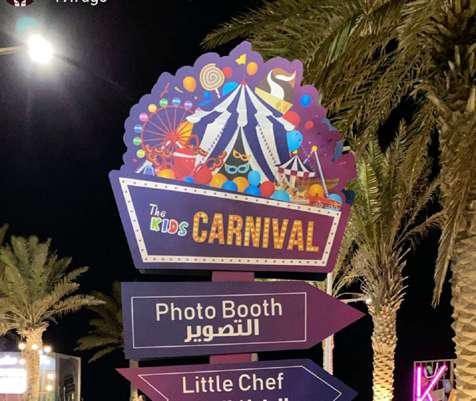
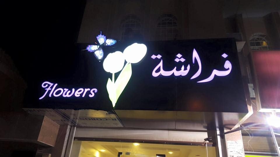
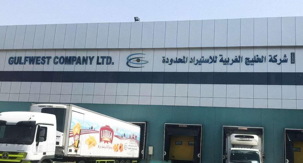
Company and shop signs we made and installed, lit and unlit.


Questions About Wayfinding Signage
What facility managers, developers and event organisers ask before they order a sign system.
What is wayfinding signage?
It is the system of signs that guides people through a building or a site: directories at the entrances, floor signs in lift lobbies, directional signs at junctions and identification signs at doors. Unlike a set of separate signs, it is planned as a whole, so each destination stays named along the route until the visitor arrives.
Which buildings need a planned wayfinding system?
Any place where first time visitors look for a specific room: hospitals and medical centres, universities, office towers with many tenants, malls, government buildings, hotels and multi level car parks. Exhibitions and conferences need temporary wayfinding for the event days.
Do you walk the building before quoting?
For a full building, yes: our team walks the routes with the floor plans and marks the decision points before the schedule is drawn. For a first estimate, floor plans and photos of the entrances and lift lobbies are enough for an itemised quote within 24 hours.
Do you also produce fire exit and safety signs?
Yes, to the schedule your safety consultant or the authority sets under the civil defence rules. Their content and positions are not a design choice, so we produce them exactly as specified and install them with the rest of the system.
Can you make tactile signs with braille?
Where the client asks for them, yes: raised letters and braille on door and lift signs, at a consistent height beside the door so a visitor who reads by touch knows where to find them. Their content follows the accessibility brief the client sets.
How are Arabic and English arranged on one sign?
Arabic usually leads, on the right or on top, and the order never changes from one sign to the next. Both scripts come from typefaces designed to sit together so they look equal, and every arrow sits on the side it points to.
What are directional signs and directories made of?
Indoors, aluminium panels with printed or cut vinyl, acrylic faces, and layered acrylic for directories and door signs. Outdoors and in car parks, aluminium and materials protected against sun and dust. The material is chosen by location and by how often the content will change.
How are signs fixed to walls, ceilings and glass?
Walls take concealed fixings, or strong mounting tape on a smooth sound surface. Ceilings take drop rods or cables fixed above the false ceiling, and glass takes clear tape or a sign made to be read from both faces. The fixing for each sign is written in the schedule before production.
What happens when a tenant or a department moves?
Directories built from strips and door signs with slide in inserts let a single line change without a new sign. With the schedule and drawings you receive at handover, the replacement matches the original typeface, colour and size.
Where are the signs made, and how do we start?
We have more than one location in the Kingdom. Your signs are made in our own factory and installed by our own team. Send floor plans, photos and logo files on WhatsApp at 0567069088 or through the quote page, and an itemised quote follows within 24 hours.
A Building or Venue Where Visitors Keep Getting Lost?
Send the floor plans and the list of places visitors look for. Within 24 hours you receive an itemised quote that lists every sign type, its location, its material and its fixing.
More specific pages on this
If your question is narrower than this page, these are written for one question each.

