
Small Exhibition Stand Design: 9 and 18 Square Metres Without the Clutter
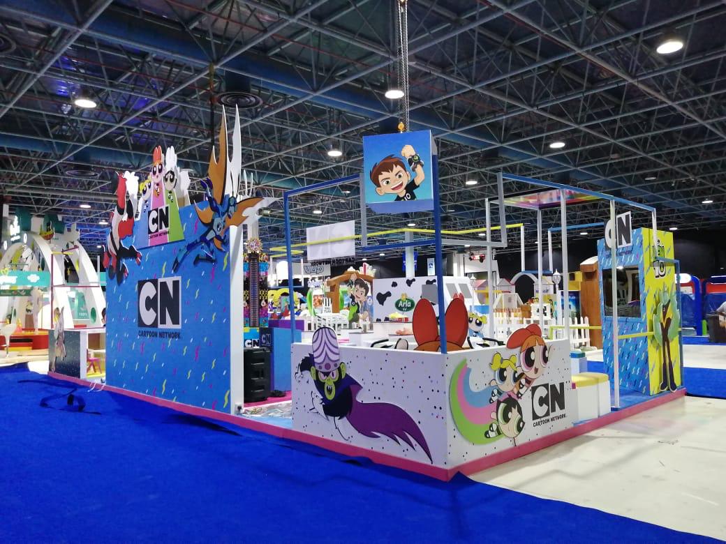
Most stands in the Kingdom’s halls are not double deck islands. They are squares of 9 square metres or rectangles of 18. And most of what fails in them does not fail because the stand is small, but because ten things were squeezed into a space that holds three: a large logo, three posters, a table, two chairs, a product shelf, a screen, bags, a brochure box, a coffee station, and a person sitting looking at a phone.
This is a guide to small exhibition stand design that works: what 9 and 18 square metres actually give you, the six rules that make a stand look bigger than it is, three layouts we work with, and when a small stand deserves a custom build and when a modular system is enough.
What 9 and 18 square metres actually give you
9 square metres (3 by 3) means one back wall, perhaps one side wall, one counter, and a visitor who stands in the aisle rather than inside the stand. No room for a meeting, no room for more than three products, no room for two of your team at once. That is not a flaw; it is the definition of the space.
18 square metres (3 by 6 inline, or 6 by 3 on a corner open on two sides) gives what 9 cannot: an area the visitor steps into, one seat for a seated conversation, a square metre of storage behind the wall, and a second wall for a second message. The corner beats the inline by a wide margin, because the second open side doubles the number of people who see the stand.
The difference between the two is not only area but behaviour: at 9 square metres the conversation happens at the counter and in the aisle; at 18 it happens inside the stand. The design follows the behaviour.
Rule one: one message, read from three metres
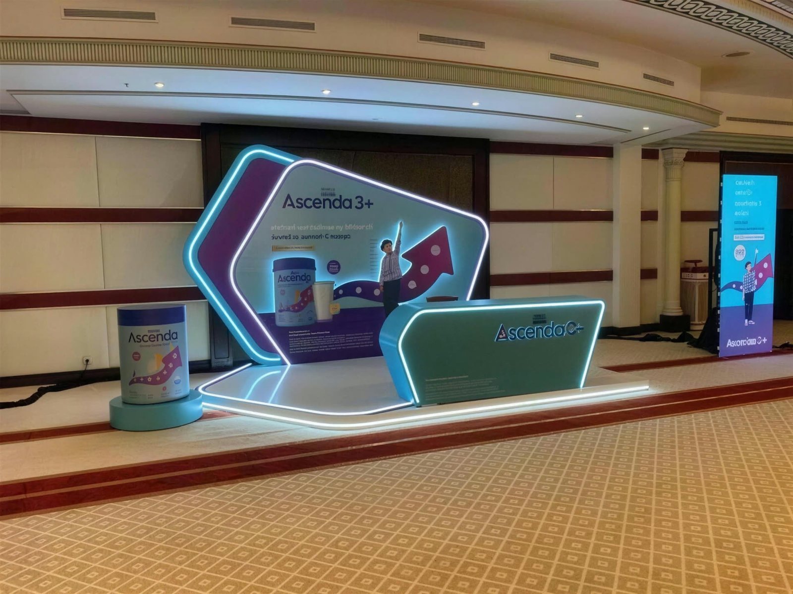
The visitor walks the aisle at walking pace and reads the stand in two seconds. The back wall of a small exhibition stand carries three things and no more: the logo at eye height, one sentence saying what you sell to whom, and one large image. A paragraph on the wall is a wall nobody reads, and three posters about three products mean the visitor understood none of them.
The size hierarchy decides what is read first: the sentence larger than the logo, the logo larger than anything else. Anything smaller than a hand at two metres high cannot be seen from the aisle at all, so it is not printed there.
Rule two: the counter is the stand
In a small space the counter is not a piece of furniture; it is the only meeting point. Three decisions:
- Position. On the open corner, not in the middle, so it neither blocks the stand nor separates your team from the aisle. A counter in the middle makes a barrier; on the corner it makes an entrance.
- Storage. A lockable counter with a shelf for bags, phones and spare samples. A small stand without locked storage becomes a visible warehouse by day two.
- The surface. Empty except for one thing: the registration tablet or a single product. Brochures go in a pocket on the side of the counter, not on top, and coffee cups never climb onto it.
The counter front is the largest graphic surface on a 9 square metre stand after the wall, and an illuminated logo block in acrylic on it is seen from the end of the aisle in a hall with flat lighting.
Rule three: storage hidden, floor empty
Everything that touches the floor of a small stand eats its space twice: once with its size and once with the walkway it needs around it. So: a square metre of storage behind the back wall or inside the counter, and no bags, boxes or poster stands on the floor. Chairs? At 9 square metres, no chairs; at 18, two high stools at a small table in the inner corner, never two chairs facing the aisle with your team on them.
A working rule: stand in the aisle and look at the stand from three metres. Everything you see on the floor other than the counter and the plinth has to disappear.
Rule four: light it yourself
Hall lighting is flat and yellow, and it makes every small stand look the same. Two to four spotlights on the frame, aimed at the back wall and the counter, change the colour of your brand in every photo taken and separate your stand from both neighbours without an extra metre. The lighting stays within the organiser’s standard height, so it needs no approval and no fee, which makes it the cheapest improvement possible on a small stand.
Rule five: three products, not thirty
A shelf carrying the whole catalogue tells the visitor you sell everything, which is to say nothing. Three products on three plinths at three heights, with one screen looping the rest in a one-minute reel, is stronger than thirty pieces on a shelf. A product that can be touched and tried earns a conversation; one behind glass earns a glance.
Rule six: one person, standing
A small stand with nobody standing at it is furniture. With two people sitting, it becomes a closed office. One host standing at the open corner, who knows the one message and knows what to ask, is what turns a passer-by into a visitor. The second team member is in the aisle or on a break, not on a chair inside the stand.
Three layouts we work with
| Space | Layout | Best for |
|---|---|---|
| 9 square metres inline (3 by 3) | Full-height back wall, counter on the front corner, one plinth in the other corner, storage inside the counter, two spotlights | A first show, conferences, a service rather than a product |
| 18 square metres corner (6 by 3, open on two sides) | One angled wall, counter on the open corner, a free entry area, a small table with two stools in the inner corner, a square metre of storage behind the wall, four spotlights | Most companies: a product to try and a seated conversation |
| 18 square metres inline (6 by 3, open on one side) | A long back wall split into message and screen, two small counters at the ends, plinths in the middle, storage at one end | A team of two, two different products, a crowded show |
Custom or modular at this size
At 9 and 18 square metres, a modular system with new graphics gives everything above: a full-height wall, a lockable counter, lighting on the frame, plinths, and set-up in hours. It is reused at the next show with new graphics only. Read about modular and portable stands before you decide; it is the first option we recommend at this size when the company exhibits more than once a year.
A custom build earns its place on a small stand when you need a shape the frame cannot give: a curved counter with an illuminated logo, a wall with a display opening, a raised floor lit from below, or a heavy product that needs a structural plinth. Custom stand or shell scheme has the full comparison between the three levels, and exhibition stand cost in Saudi Arabia what each costs per metre.
The hall changes the small stand
At the large Riyadh shows a 9 square metre stand is one of hundreds in a row, so lighting and the one message are what set it apart, and each hall’s standard height limit decides whether your wall rises above the neighbour’s; the details are on our exhibition stands in Riyadh page. The industrial shows in Dammam are mostly 9 and 18 square metre stands with heavy products that need a plinth and a calculated floor, which our exhibition stands in Dammam page explains.
Mistakes that make a small stand smaller
- Three posters about three things. The visitor reads none of them. One message.
- The counter in the middle. A barrier between your team and the aisle. On the open corner.
- Two chairs facing the aisle. Your team sits on them and the visitors disappear. One person, standing.
- Bags and boxes on the floor. The first thing the visitor sees on day two. Locked storage.
- Relying on the hall lighting. A flat, yellow stand. Two spotlights at least.
- The whole catalogue on a shelf. Three products and a screen.
- Graphics designed on a screen, not at three metres. Print one page at real size and tape it to the wall before approving the file.
The result is measured, not felt: a small stand with ten serious conversations beats a large one with a hundred visitors who took a giveaway. Our exhibition stands page covers what we deliver at every size, from 9 square metres to an island. Research from the Center for Exhibition Industry Research, CEIR, has shown for years that visitors decide whether to stop at a stand in seconds, which is why the one message, not the area, is what decides.
Frequently asked questions
What matters most in small exhibition stand design?
One message read from three metres, one counter on the open corner, and an empty floor. Everything else is detail in service of those three.
Is 9 square metres enough at a large show?
Yes, if the goal is serious conversations rather than visual presence. A 9 square metre stand with its own lighting, one message and a standing host produces more leads than a crowded stand with no focus.
Corner or inline at 18 square metres?
The corner open on two sides, always, when it is available, because the second side doubles who sees the stand and gives a natural entrance. Ask the organiser early, because corners are booked first.
Custom or modular for a small stand?
Modular with new graphics in most cases, especially when you exhibit more than once a year. Custom when the shape needs what the frame cannot give: a curved counter, a large illuminated logo or a heavy product.
How many products should I show on a small stand?
Three, on three plinths at three heights, with one screen showing the rest. A product that can be touched earns a conversation; a full shelf earns a passing glance.
Do I need the organiser’s approval for a small stand?
No, as long as it stays within the standard height and uses fire-rated materials. Any wall above the limit or a suspended structure needs approval, and that is rare at 9 and 18 square metres.
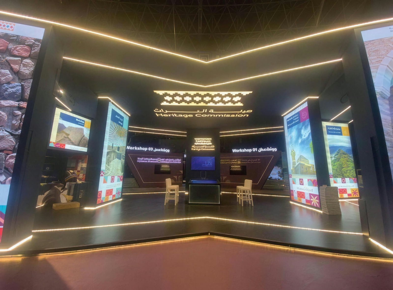
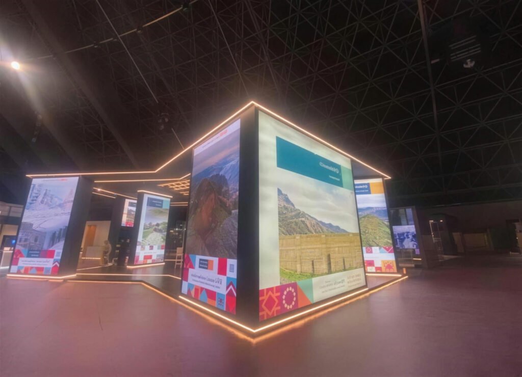
Stands we designed, built and installed
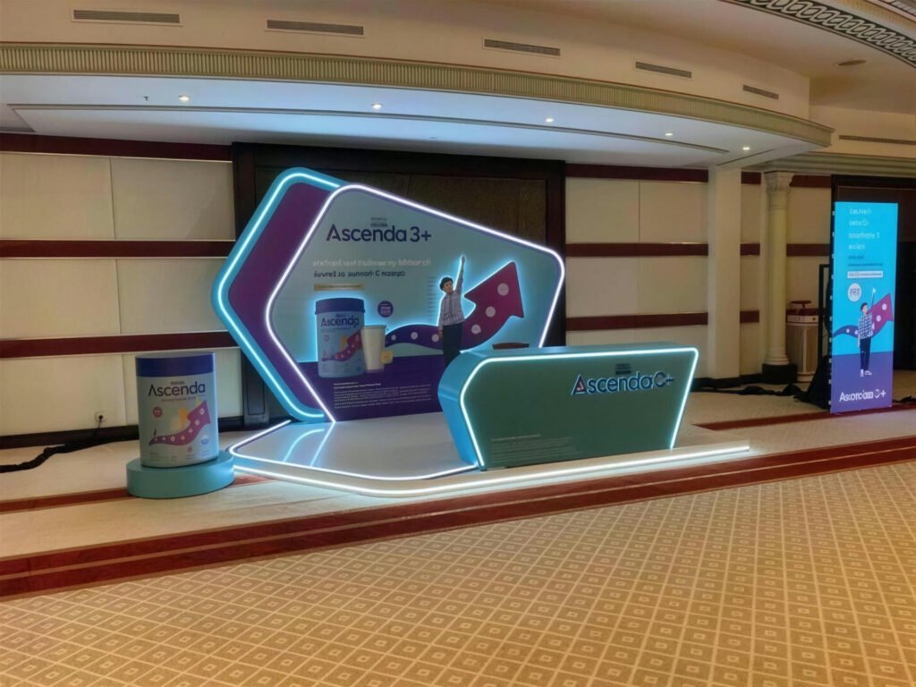
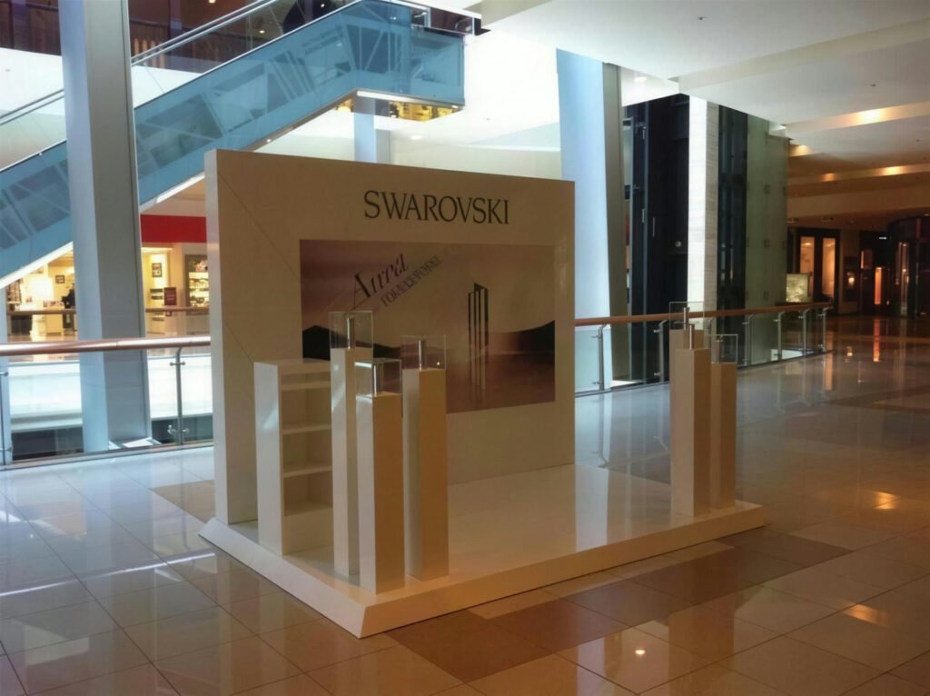
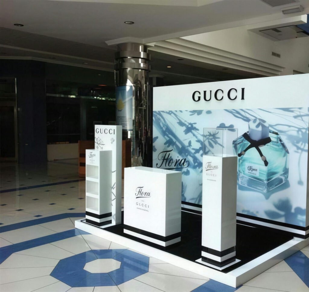
Photographed on site after handover, no renders.
Have a project and want a real number?
Send the area, the date and the city, and we come back with an itemised quote within 24 hours. No commitment, and no vague all-in price.

