
Landing Page Design
Landing Page Design for a Campaign With One Job
Landing page design starts from a single question: what should the visitor do next? A landing page is where an ad, a social post, a QR code on a stand or a printed flyer sends people, and it exists for one action only, whether that is leaving a name, asking for the offer on WhatsApp, booking a call or applying for a job. We design and build these pages in Arabic and English for marketing campaigns, product launches, offers and recruitment drives, with the tracking set up in your own accounts. This page covers what goes on the first screen, what the form should ask, how the page stays quick on a phone, how a conversion is counted, and what happens after the visitor presses send.
Why a Campaign Needs a Landing Page of Its Own
Sending paid traffic to a home page asks the visitor to find the offer on their own, and few of them look for long. Good landing page design removes everything that is not the campaign and leaves one clear step in front of them.
One goal per page
A home page has a menu, a long list of services and a news section, and every link is a way out. A campaign page has one offer and one action, and the navigation is removed or reduced to the logo. When a campaign has another audience or another offer, it gets another page, not another tab on the same one.
The message on the first screen
On a phone, the first screen before any scrolling carries the whole argument: a headline that repeats the promise of the ad the visitor just tapped, a line on who the offer is for, a clear picture of the product, and the button. Someone who reads only that screen should still know what you want them to do and why.
A form that asks only what you will use
Every field is another reason to leave. Name and mobile number are often enough for a first contact, with a city or a branch when the follow up depends on it. Budget, company size and job title belong in the follow up call, not in front of a stranger who has not decided yet.
WhatsApp and a call, not only the form
Many customers in the Kingdom would rather ask on WhatsApp than fill in a form, and some would rather call. The page carries a WhatsApp button that opens a chat with a prepared first message naming the campaign, and a call button that dials straight from the phone. Each press is recorded as a conversion, so the form is not the only measure of interest.
What Sits Around the Page
A landing page is the end of a path that starts on a screen, a stand or a box. These services build the rest of that path under one management.
Printing & Promotional Gifts
Flyers, stickers, boxes and roll ups that carry the QR code to the page, printed in 1 to 5 working days once the artwork is approved.
Acrylic & Wood Fabrication
Acrylic QR holders for counters, tables and cashier points, so the code sits where the customer is already standing.
Promoters & Brand Ambassadors
Hosts with a supervisor who invite visitors at a stand or in a mall to scan the code and help them finish the form on the spot.
Branding & Creative Studio
The campaign look, its key visual and its headline, so the page, the ad and the printed pieces read as one piece of work, not as separate jobs.
Digital Solutions
The page itself, its form, the connection to your inbox or CRM, and the analytics, built as part of the websites we develop.
Experiences & Events
Launches, mall events and roadshows whose visitors are sent to the page to claim an offer or register their interest.
Social Media & Content
Posts, reels and stories that carry visitors to the page, written and shot to match its headline.
Custom Exhibition Stands
Stands that carry a QR code on the counter and the back wall, so visitors at a show leave their details on the page before they walk on.
Landing Pages for Every Kind of Campaign
There is no single template in landing page design, because the structure of the page follows the action you want. These are the pages Saudi brands ask for most, and each one is arranged differently.
A campaign offer page
A discount, a bundle or a gift with purchase, for a limited period. The headline states the offer itself, the conditions follow underneath in plain words, and the end date is visible. The action is usually to claim the offer on WhatsApp or to leave a number for a call back, and the page closes or changes its message when the campaign ends.
A product launch page
A new product, a new flavour or a new branch. The page shows the product from the angles that matter, explains what is new in a few lines, and asks for one thing: register interest, preorder, or find the nearest branch. Before launch day it can collect names for a waiting list, then switch to the sales message on the day itself.
A lead form for business buyers
For a company that sells to other companies, the page exists to start a conversation with a buyer. It names the problem the service solves, shows proof such as client logos you are allowed to use or certificates, and ends in a short request form. Its success is the quality of the leads, not their number, so the form may ask one qualifying question, such as the type of business.
A QR page for a stand, a mall or packaging
The person opening this page is standing in a hall, walking past a kiosk or holding a box. So it loads quickly, fits on a single screen where possible, and offers something worth the scan: a draw, a sample, a usage video, a warranty registration or a discount on the next visit.
A recruitment drive page
When a company is hiring for a branch opening or a season, the page tells applicants the roles, the city, the conditions and the steps, and takes a short application. Arabic leads for most roles. The form asks only what the first screening uses, and a CV upload is optional when a phone call will follow anyway.
A seasonal page
Ramadan, Founding Day, National Day and the back to school season each bring their own campaigns. A seasonal page is prepared before the season so the ads have somewhere to land from the first day, and its message, imagery and offer belong to that occasion alone, after which it closes.
How Landing Page Design Runs From Brief to Launch
Most delays on a landing page come from content that is not ready and decisions made late. The order below avoids both, and puts each decision where it belongs.
The goal and the audience
We start by agreeing the single action the page asks for, who will see it, where they will come from and what counts as a result. That definition becomes the conversion event in the analytics, so the report at the end measures what you actually wanted, not visits alone.
The message and the layout
A plain wireframe sets the order of the page: the first screen, the proof, the details of the offer, the questions people will ask, and the form. Headlines are written in Arabic and in English at this stage, each in its own language, and approved before any design starts.
Content and photography
The page needs real product images, the offer terms, the logo files and any proof you can show. If the photographs do not exist yet, our team shoots them in our studio setup or on your site, following the campaign key visual so the page matches the ad that sent the visitor.
Design and build in both languages
The Arabic version is laid out right to left from the start, with its own line lengths and button positions, and the English version left to right. Both are built for the phone first, then checked on a large screen, and the form is connected to the inbox, sheet or CRM where your team will receive the leads.
Tracking, consent and testing
Analytics and the ad pixels you use are installed in your own accounts, with a consent banner where cookies need one and a line under the form saying why the details are asked for. The form, the thank you page, the WhatsApp button and the call button are each tested as events, on real phones and on mobile data, before any ad goes live.
Launch, QR codes and follow up
The page goes live, the QR codes for printed pieces are generated from the final address and tested on the printed proof, and we read the first days of data with you. Where traffic allows, version A and version B of the headline or the offer run side by side, and the weaker one is retired.
How Long a Landing Page Takes
The page itself
It depends on how ready the content is: approved copy, product images and clear offer terms shorten the work, while missing photographs and late approvals lengthen it. The quote states the date.
If photographs are needed
A shoot adds its own booking and editing time, which depends on the number of products and the location, and the quote names it as a separate stage.
Printed pieces with the code
Printed in 1 to 5 working days once the artwork carrying the tested code is approved.
Your quote
An itemised quote arrives within 24 hours of receiving the brief.
What Shapes the Cost of a Landing Page
We publish no price list for landing page design, because every campaign needs a page of its own. These are the things that change a quote, named so you can compare offers fairly and see what you are paying for.
Versions and languages
An Arabic page, an English page and any extra version for another audience, city or offer each need their own copy, layout checks and testing. For version A and version B of the same page, the parts that differ are counted as separate builds.
Content that is ready, or not
Approved copy, sharp product images and clear offer terms keep the cost close to design and build. Writing the copy, shooting the product or producing a short video are named lines when they are needed.
The form and where its data goes
A form that sends an email is simple. A form that writes to your CRM, sends an automatic reply by email or message, or routes leads to different branches by city needs setup and testing for each connection.
Tracking and reporting
Installing analytics and ad pixels in your accounts, defining the conversion events and preparing the report are separate lines, so you can see what is measured and who receives the report.
Hosting and the address
The page can live on your own domain or on ours, as agreed. A subdomain on your domain needs a small change from whoever manages it, and the period the page stays live after the campaign is stated in the quote.
Printed pieces and QR codes
Flyers, stickers, table holders, box inserts and roll ups that point to the page are quoted as print lines by quantity and finish, and every printed code is tested against the live page before the run.
Send the campaign goal, the offer, the audience and the launch date, with any copy and images you already have. An itemised quote for your landing page reaches you within 24 hours. Request a quote or message 0567069088 on WhatsApp. When the page will be scanned at an exhibition, our guide to exhibition stand cost in Saudi Arabia shows how the stand budget around it is built.
Where Visitors Arrive From: Ads, Stands, Malls and Packaging
A landing page is judged by the people who reach it, so every route in is planned before the page is drawn. Paid ads on Snapchat, TikTok, Instagram and Google bring visitors who tapped a specific promise, and the headline has to repeat it in the same words. Posts, stories and influencer content bring warmer visitors who already know the brand. Routes away from the screen need a QR code: on the counter and back wall of a stand, on a mall kiosk, on a flyer handed out by a host, on a sticker or inside a box. Each route gets its own tagged link or its own code, so the report shows which stand, which flyer and which post produced the leads, not a single total. A printed code is placed at a height and size a phone can read from where people stand, with a short line saying what the scan gives them, and it is scanned from the proof before the full run is printed. If the campaign is an event with a guest list, invitations and check-in at the door, that is a different tool, covered on our event registration website page. For the wider range of websites and stores we build, see digital solutions. The look the page follows comes from our branding and creative studio, the images from product photography, and the posts that carry visitors to it from social media content creation. When the code stands in a shopping centre, our page on mall activation in Saudi Arabia explains the set and the hosts around it.
A Landing Page, a Website Page or WhatsApp Alone?
Landing page design is not always the answer. These questions decide where a campaign should send people, and what is worth building.
Does the campaign ask for one action?
If the ad promises one thing and asks for one response, a landing page fits. If people need to compare many products or services, a well organised section of your website, or your online store, serves them better.
Does the campaign have an end date?
Offers, launches and seasons end, and their page can end with them or switch to a closing message. Permanent services belong on the main website, where they build search visibility over time.
Do you need data, or only conversations?
If your sales team works on WhatsApp alone and needs nothing recorded, a link straight to a chat can be enough for a small campaign. Once you want to know which ad, which stand or which flyer brought each customer, you need a page with tracking.
Are you paying for the traffic?
With paid ads, every visitor who lands on a weak page is money spent with nothing to show for it. A dedicated page with a single message usually makes the same budget work harder, and it gives the ad platforms conversion events to learn from.
Does your audience read Arabic, English or both?
A consumer campaign in the Kingdom usually leads in Arabic, while a campaign aimed at managers of many nationalities may lead in English. When both audiences matter, each version is written for its reader, and the ad sends each audience to its own language.
Mistakes That Waste a Campaign Budget
Each of these is a landing page design decision, cheap to prevent before launch and expensive once the ads are running.
A form with too many questions
A long form looks thorough to the team that wrote it and looks like work to the person filling it in. Every field the follow up call could ask instead is removed, and optional fields are clearly marked as optional.
An Arabic page translated, not written
Machine translated headlines, English punctuation in Arabic text, a phone field that types from the left and icons pointing the wrong way all tell the visitor that Arabic was an afterthought. The Arabic version is written and laid out in its own language, then checked on a phone.
A heavy page on mobile data
A full screen video that plays on load, uncompressed photographs and a stack of web fonts look fine on office Wi Fi and crawl on a phone in a car park. Images are compressed and sized for the screen, video starts only when tapped, and the page is tested over mobile data.
A QR code printed before the page was final
A code printed on a large run cannot be changed. If it points to a test address, or to a page that later moves, every flyer is wasted. Codes are generated from the final address or from a redirect you control, and scanned on the proof before printing.
Tracking in someone else's account
When analytics and pixels sit in an agency account, the whole history leaves with the agency when the contract ends. Tracking is installed in accounts you own, and the people working with you are added as users.
Leads that nobody calls
A form that sends leads to an inbox nobody watches turns a good campaign into a bad one. The thank you page tells the visitor what happens next and when, an automatic reply confirms the request, and a named person on your team receives each lead while it is still fresh.
One Team From the Ad to the Printed Code
The campaign look, the copy in Arabic and English, the product photographs, the landing page, the printed pieces carrying the QR code, the stand or mall set where it is scanned and the hosts who invite people to scan it can all come from one team, so the promise in the ad is the promise on the page. Brands we have worked for include Kinan, Saudia Holidays, Ganache, Oceanera, Swarovski, Gucci Flora and Johnson & Johnson MedTech.
Design From Our Studio
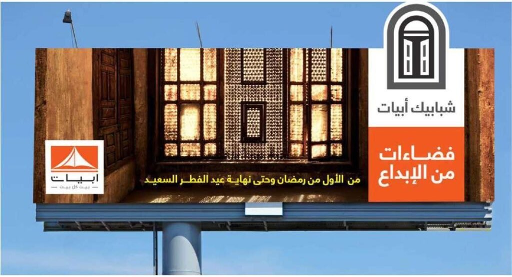
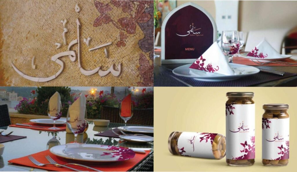
Identities, print and design work we delivered to clients.



Questions About Landing Page Design
What marketing teams ask about landing page design before they brief a campaign page.
What is a landing page, and how is it different from a website?
A landing page is a single page built for one campaign and one action, such as leaving a number or asking for an offer on WhatsApp. A website presents the whole company and lets visitors browse. The landing page removes the menu and the distractions, so the visitor either acts or leaves, and both outcomes are measured.
What should the form on a landing page ask?
As little as the next step needs. Name and mobile number are often enough, with a city or a branch when the follow up depends on it. Anything the sales call can ask later is left out, because every extra field costs completed forms.
Do you build the page in Arabic and English?
Yes. The Arabic page is written and laid out right to left, the English page left to right, and each has its own headlines rather than a translation of the other. The ads can then send each audience to its own language.
Can the page have WhatsApp and call buttons?
Yes, and for many Saudi audiences they matter as much as the form. The WhatsApp button opens a chat with a prepared first message that names the campaign, the call button dials straight from the phone, and each press is tracked as a conversion.
Who owns the visitor data and the analytics?
You do. The analytics, the ad pixels and the lead records are set up in your own accounts, and the people working on it are added as users. When the campaign ends, the data and its history stay with you.
How is a conversion counted?
A conversion is the action the page exists for: a form sent and the thank you page reached, a WhatsApp chat opened, or a call started. Each one is defined as an event before launch and tested, so the report counts real actions and shows which ad or which QR code produced them.
Do you run version A and version B tests?
When a campaign brings enough visitors, version A and version B of the headline, the image or the offer can run side by side, and the one that brings more conversions stays. With little traffic the difference between the versions cannot be relied on, and a single strong page is the better use of the budget.
Can you print the QR codes that point to the page?
Yes. Codes go on flyers, stickers, boxes, table holders, roll ups and exhibition stands, and each one is generated from the final address and scanned from the printed proof before the run. Printing takes 1 to 5 working days once the artwork is approved.
Where will the page be hosted?
On your own domain, often as a subdomain or a path on your website, or on ours, as agreed in the quote. The quote also states how long the page stays live after the campaign and what happens to it afterwards.
How long does it take, and how do we start?
It depends on how ready the content is: approved copy and images shorten the work, while a product shoot or late approvals lengthen it, so the quote states the date. Send the goal, the offer and the launch date on WhatsApp at 0567069088 or through the quote page, and an itemised quote follows within 24 hours.
A Campaign Coming Up? Give It a Page of Its Own
Send the goal, the offer, the audience and the launch date. Within 24 hours you have an itemised quote that names the page versions, the form connections, the tracking and any printed pieces carrying a QR code.
More specific pages on this
If your question is narrower than this page, these are written for one question each.

