
Construction Company Branding: From Site Boards and Helmets to the Tender File

Construction company branding is judged outdoors long before anyone opens a website. Most people first meet a contractor as a name on a hoarding around an empty plot, on a board at a site gate, on the back of a high visibility vest or on the door of a pickup passing at speed. A tender committee meets the same name later, on the cover of a technical proposal and at the top of every page of the company profile. That is why the identity of a contractor is built to rules a café or a shop never faces. This guide covers what the identity has to carry in the construction sector, how it stays readable at a distance and under a hard sun, how Arabic and English names share one board, how one identity holds across many sites running at the same time, and what a profile needs before it goes into a bid.
It is written for owners and managers of general contractors, specialist subcontractors in electromechanical works, roads or interior fit out, and developers who run their own building arm. The advice applies to a company choosing its name now, to a company whose identity grew piece by piece over the years, and to a company preparing for larger bids that discovers its old logo does not survive the trip from a business card onto a hoarding the length of a street.
Where construction company branding is seen first
A retailer’s identity lives on a shop front and a shelf. A contractor’s identity lives on temporary structures in changing places, worn by people who work in heat and dust, and inside documents that are scored line by line. Each place has its own limits, and a logo that ignores them fails quietly: it turns into a smudge on a vest, a pale patch on a sun bleached panel, or an unreadable band on a board the municipality inspects. The table lists the places that matter most, who reads each one and from how far, and what the identity needs to do its job there.
| Touchpoint | Who reads it, and from where | What the identity must handle |
|---|---|---|
| Site hoarding | Drivers and passers by, from across the road and on the move | Large simple shapes, a short message, panels replaced as they weather |
| Project board | Inspectors, suppliers and neighbours at the gate | Content usually set by the permit or the owner, with a slot for the contractor |
| Gate and site office | Visitors, delivery drivers and new staff | A name and a direction grasped at a glance, with room for safety signs in their standard colours |
| Helmets, vests and coveralls | Everyone at work, close up and from afar | A compact mark that copes with curves, thread and fluorescent grounds |
| Pickups, crew buses and plant | Road users and site crews | A placement rule that fits many body shapes and keeps fleet numbers clear |
| Tender documents and profile | Evaluation committees and consultants, at a desk | Clean templates, matching names and a file that proves the capacity to deliver |
| Head office sign and stationery | Clients and partners who visit or receive letters | The formal face of the company, in better materials and finishes |
Logo design for a construction company that stands apart
Look through contractors’ logos and the same pictures come back again and again: a tower crane, a sloping roofline, a row of towers, a helmet, a bricklayer’s trowel. They say construction, but they say it for every competitor too, and in a crowded classification a mark that could belong to anyone is hard to remember and harder to protect at registration. Memorable construction company branding takes a stronger route, starting from what belongs to your company alone: its name, its initials in Arabic or English, a form drawn from the kind of work you are known for, or a plain geometry that stays clear when it is cut, stitched or stencilled.
Production limits weigh more in this sector than in most. A contractor’s logo is printed on mesh, cut from vinyl, embroidered on caps, stuck on curved helmets, painted on steel and printed tiny in the corner of the title block on shop drawings. Hairlines, gradients, shadows and fine outlines collapse in nearly all of these. Before any route is approved, ask to see it in one solid colour, reversed in white on a dark ground, at the size of a helmet sticker and at the size of a full hoarding panel. If it fails at any of these, it will be redrawn later at a higher cost, usually in a rush before a new site opens. Our logo design company page explains how a mark is drawn in both scripts together and tested from its smallest use to its largest.
Colour is a decision of its own. Safety signs on a site follow a fixed code in which red, yellow, blue and green carry meanings set by the international standard for safety signs and by the project’s safety plan. A brand built on the same saturated red or yellow can look like a warning from a distance, or melt into the safety signs around it. Many contractors therefore pick a deep main colour, such as navy, dark green or charcoal, with a lighter accent, so the name stays readable on a white panel, on concrete grey and on a fluorescent vest.
Reading at a distance and under the Saudi sun
Most of a contractor’s identity is read in a few seconds by someone who is not trying to read it at all. A driver passing a hoarding takes in a shape, a colour and perhaps a name. That sets the rule for anything printed large: the name and the logo, one line on what the company does, and a website or number big enough to note down. A hoarding that carries a whole paragraph, a list of services and a row of certificate logos is read by nobody. A good hoarding tells the passer by who is building here, and stops there.
Letter height grows with the distance it has to be read from, and sign makers work from a rule of thumb that links the two. The practical test is simpler: print a section of the panel at full size, fix it where it will stand, and look at it from the opposite pavement and from inside a moving car. Contrast does more than size. Dark letters on a light ground, or white letters on a deep colour, carry further than two mid tones side by side, and two brand colours of similar brightness merge into one at a distance even when they look nothing alike on a screen.
The climate in the Kingdom adds its own tests, and construction company branding that ignores the sun fades before the first project is handed over. Strong sun fades some inks and films faster than others, and reds and oranges are often the first to weaken, so a brand red can drift toward pink on an old panel. Ask for inks and films made for outdoor use, and plan to replace panels on long projects rather than leave a faded name in public view. Gloss laminate throws glare at certain angles, while a matt finish stays readable through more of the day. Dust settles on every horizontal edge, so very pale grounds look dirty quickly and small detail fills in. On large hoardings, perforated mesh lets the wind pass through and eases the load on the frame, but it swallows fine detail, so the artwork printed on it is kept broad and bold. After dark, a board beside a road is either lit or forgotten, so decide early whether the main boards need lighting or reflective lettering.
Arabic and English names on one board
Contracting companies in the Kingdom usually trade under a long registered name, often ending in a phrase meaning for general contracting, and a shorter name people actually say. The identity has to settle which form appears where. The full registered name belongs on contracts, letterheads, the profile cover and any document that must match the commercial registration and the classification certificate letter for letter. The short form, agreed once and used the same way everywhere, belongs on hoardings, helmets and vehicles, where the long name would shrink until it disappeared.
Both scripts deserve the same care. Government owners and municipal inspectors read Arabic first, while international partners, consultants and many engineers on site read English. An English acronym rarely has an Arabic counterpart in common use, so if the company is known by its initials, decide how the Arabic side carries the same identity: the full Arabic name, a drawn Arabic short form, or the symbol alone. Arabic reads from the right and English from the left, so on a wide board the two names usually face each other around the logo instead of being stacked as a line with a caption beneath it. Spelling, word order and the legal designation must match the registration in both languages on every formal document.
One identity across many sites at once
A contractor running several projects seldom visits all its sites in a single week. Each project manager orders the hoarding, the board, the cabin signs and the vests from the nearest supplier, and a year later the company has as many versions of itself as it has sites. The cure is a site kit: a short part of the brand guide written for the people who set up a new project, not for designers, and the part of construction company branding that does the heaviest work.
A useful site kit holds:
- Hoarding templates built on a module that suits common panel sizes, with fixed places for the logo, the message and the contact line, and a rule for corners and gates.
- A project board template with the contractor’s area already defined, ready to drop into whatever layout the permit requires or the owner asks for.
- Cabin, gate and direction signs under a consistent header band, with the safety symbols kept in their standard colours inside it.
- Placement rules for helmets, vests, coveralls and vehicles, drawn as simple diagrams a supervisor can follow without a designer at hand.
- Co-branding rules for joint ventures, main contractors and subcontractors: which logo leads, the order of the names, and the clear space each mark keeps around it.
- Print specifications naming the materials, inks and colour references, so a panel replaced halfway through a project matches the panels beside it.
The order between marks is the delicate part. On many projects the hoarding belongs to the owner’s marketing, especially when a developer is selling units, and the contractor’s name sits in a band or a panel near the base. On government projects the owning entity often hands over its own board template, and the contractor fills the slot given to it. A site kit that expects this, with a version of the contractor’s block designed for a supporting role, saves a last minute redraw when the owner’s template arrives late.
Crews, helmets and vehicles
On a working site the identity moves on people and machines. Helmet colours are usually set by the safety plan to tell roles apart, such as engineers, supervisors, operatives and visitors, so the brand does not choose them. What the brand owns is the sticker: a compact version of the logo, often the symbol alone or the short name, sized to sit on the curved shell without wrapping over its edges, and printed on a film that copes with sun and sweat. Vests are usually fluorescent yellow or orange so they are seen, and the brand colours may clash with both. A single colour version of the logo made for a fluorescent ground, normally in a dark tone, keeps the company name clear on the back of a vest without fighting the reflective strips.
Coveralls, polos and caps carry the logo by embroidery or print, and the fabric matters as much as the logo in summer heat. Supervisors and site engineers often wear a different garment from the operatives, which helps a visitor find the right person. Our corporate uniforms page explains how garments are chosen by role, how the logo file is prepared for thread, and how reflective strips can be added for staff who work near vehicles.
Vehicles take the identity further than anything else. Pickups, crew buses, water tankers, trucks and site plant come in many body shapes and colours, most of them white, so the guide needs a placement rule rather than a single drawing: the logo and short name on the doors, the website or number where the driver behind can read it, and the fleet number left clear. Heavy plant such as excavators and cranes offers only narrow flat surfaces, so the compact version of the logo earns its place again. Check the rules that apply to markings on commercial vehicles before the layout is fixed, and make sure the identity works in a single colour, because many vehicle applications are cut from one film.
Company profile design for a construction company, and the tender papers
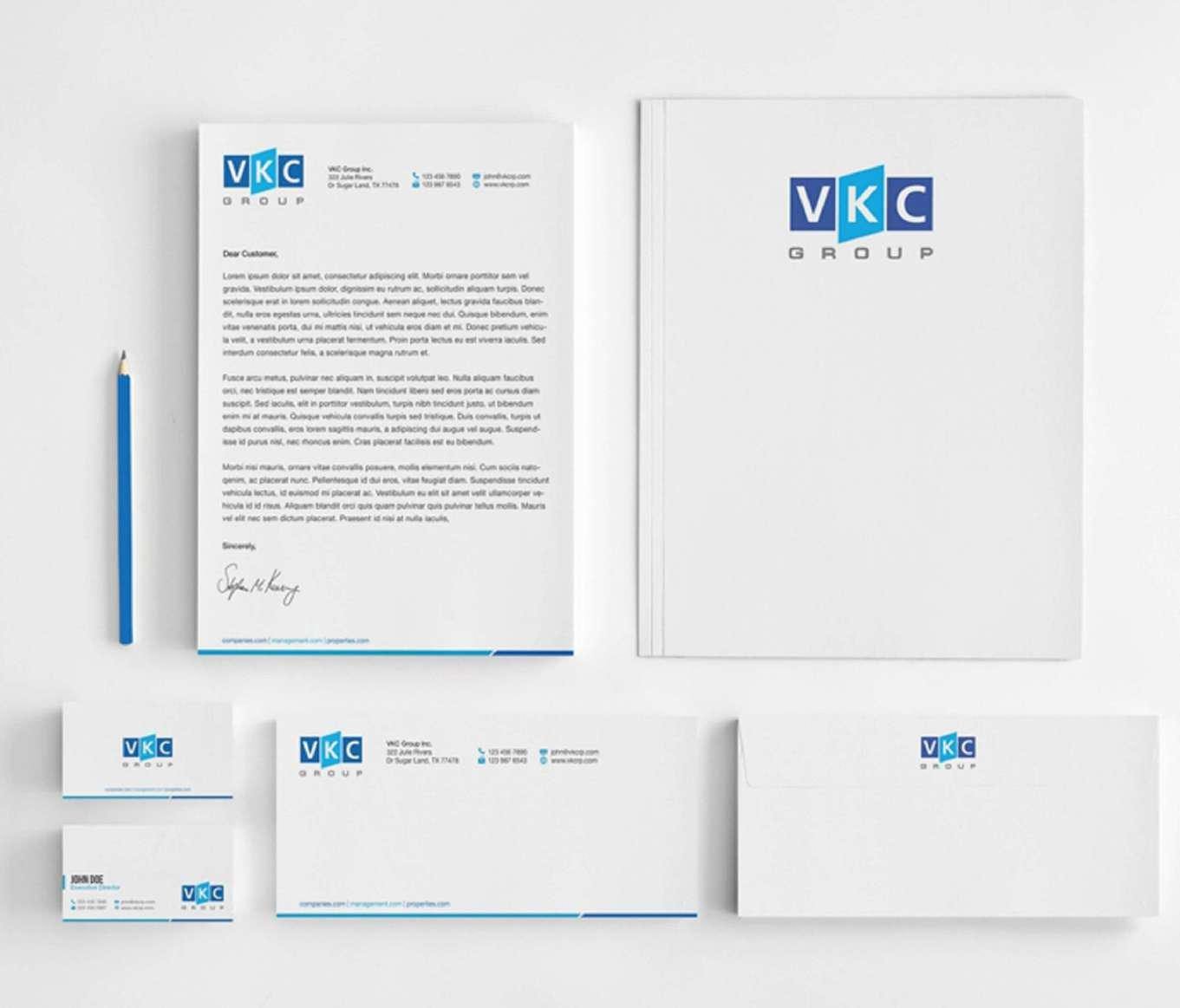
Most contractors win work on paper first. A prequalification file, a technical proposal and the company profile are read by a committee comparing several bidders against the same list, and the identity shows there as order and consistency far more than as decoration. The documents a contractor issues every week carry the brand more often than any hoarding: the title block on shop drawings, submittal and transmittal forms, method statements, inspection requests, daily and monthly progress reports, and the cover of every proposal. When these templates are designed once and installed for the whole team, using fonts that every engineer’s computer really has, each document reads as coming from the same company. Letterheads, folders and envelopes come from the same files through our corporate stationery printing.
The profile itself needs evidence other sectors can do without. When someone searches for company profile design for a construction company, what the committee actually wants is:
- Project reference sheets, one per project, giving the owner, the consultant, the scope delivered with the company’s own resources, the location and the status, with photographs during and after the work, and a client’s name shown only with that client’s permission.
- The classification and registrations, named exactly as they read on the certificates, with the scanned copies in an appendix.
- Equipment and plant, separating what the company owns from what it hires, ideally photographed with the company identity visible on the machines.
- The organisation and key staff, including the site roles a project will depend on, with their CVs in an appendix.
- Health, safety and quality, the management system certificates the company holds, how site safety is run and recorded, and photographs of crews in complete protective equipment.
Photographs carry great weight here. A profile illustrated with your own branded hoardings, uniformed crews and marked vehicles shows an organised company in a way no paragraph can, while a single site photograph missing part of the protective equipment undoes the whole safety section. Our article on what a company profile should include walks through the sections in order, and the company profile design page explains how we write, design and print the file in Arabic and English.
Checklist before a new site opens
Go through this list with the project manager and whoever orders site materials, before the hoarding goes up.
- The company name on the board matches the commercial registration and the classification certificate in both languages.
- The owner’s board template, if there is one, has arrived, and the contractor’s block fits its slot.
- The hoarding artwork carries the logo, a single line and a contact people can read from across the road.
- A full size printed section of the hoarding has been tried on site and viewed from a distance.
- Panel materials and inks are made for outdoor use, and replacement panels print from the same file.
- Safety signs keep their standard colours and symbols inside the branded frame.
- Helmet stickers, vest prints and caps use the compact and single colour versions of the logo.
- Joint venture or subcontractor logos follow the agreed order and clear space.
- Vehicle markings follow the placement rule and leave fleet numbers readable.
- Daily report, submittal and inspection templates carry the current identity and the project name.
- The profile edition attached to the tender file carries the same name as the board at the gate.
- A named person checks the branding throughout the project and orders replacements.
How The Touch works with contracting companies
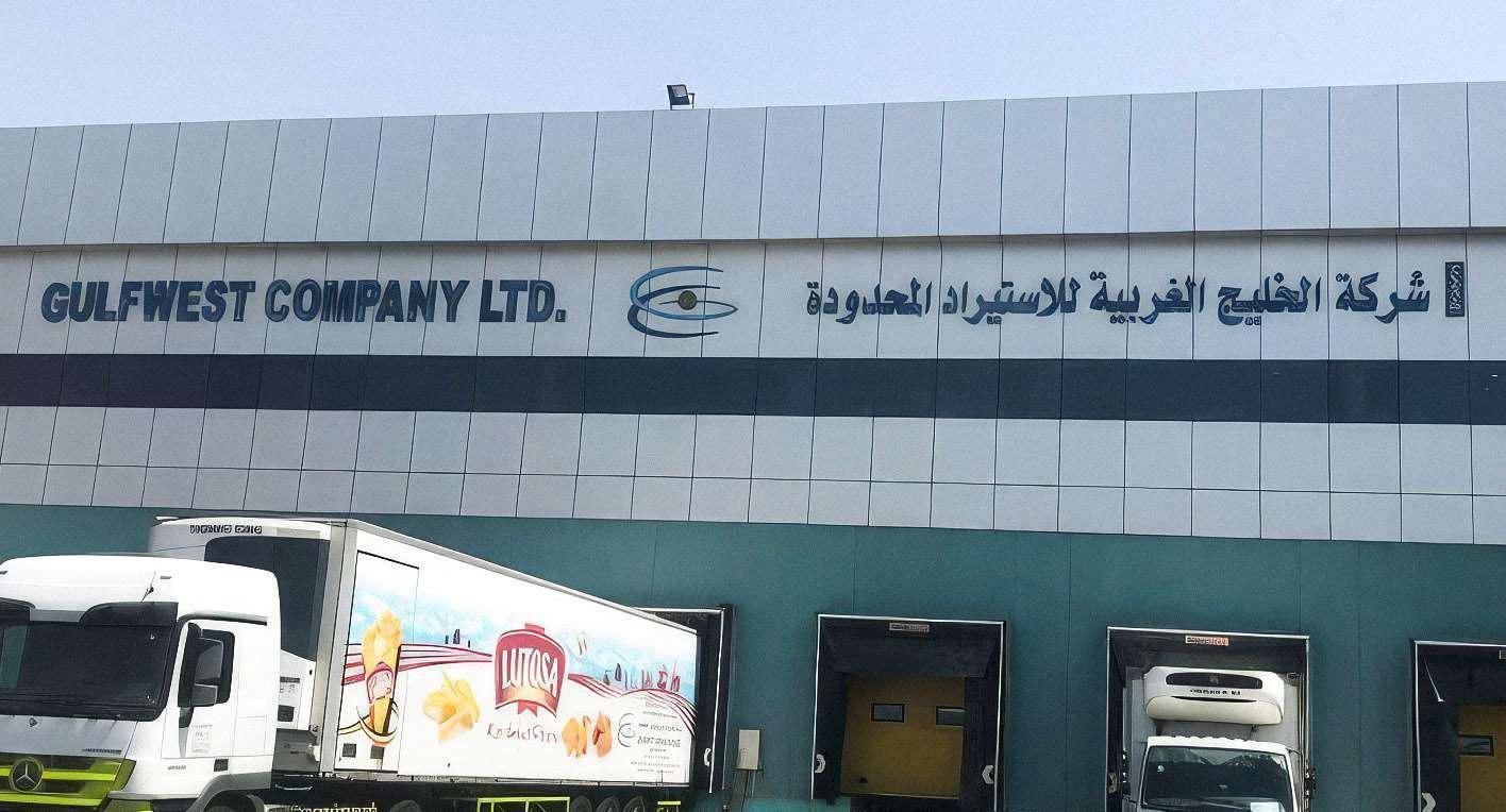
At The Touch, construction company branding is designed and then produced under one roof. Our branding and creative studio builds the identity and its guide, site kit included, and draws the Arabic and English names as one mark. Building signs, name letters and project boards are made in our own factory and installed by our own team, as our signage company in Saudi Arabia page describes, while hoarding graphics, stickers and stationery are printed in our own factory too. We have worked for Al Khaleej Al Gharbiya, and their name sign is pictured below.
If you are weighing the budget before you start, our guide to what shapes the cost of branding explains the factors behind an identity quote. Send us your registered name in Arabic and English, your current logo if there is one, and a list of the places the identity will appear first, whether a new site, a fleet or a tender deadline, and an itemised quote reaches you within 24 hours.
Frequently asked questions
What does construction company branding include?
It covers the logo in Arabic and English with its compact and single colour versions, the colour and type system, and a guide holding the hoarding, project board and site sign templates and the rules for helmets, vests and vehicles. It reaches the everyday document templates, the profile and the letterhead. The key is that the site kit is written for the people who apply it on site, not only for designers.
Should a contractor’s logo show a building or a crane?
It does not have to, and it often hurts. Those pictures are so worn in the sector that they describe every competitor, which makes your mark harder to remember and to protect. A form drawn from the name, the initials or a plain geometry stays clearer on a helmet and on a hoarding alike.
Which name goes on the hoarding, the registered one or the short one?
Hoardings, helmets and vehicles work best with the agreed short form, because the long name shrinks until it cannot be read. The full registered name stays on contracts, the profile and the project board where the permit requires it to match the registration. What matters is that the short form is used the same way at every site.
Can we use the brand colour for helmets and vests?
Helmet colours are usually set by the safety plan to tell roles apart, and vests are fluorescent yellow or orange so they are seen. The brand therefore comes in through a sticker on the helmet and a single colour print on the back of the vest. Ask the project’s safety officer before making any colour decision.
Who decides what goes on the project board?
Usually the building permit or the owner, and it may call for the permit number, the owner, the consultant and the contractor. Government entities often hand over their own template. The identity’s job is to supply the contractor’s block at the gate, ready to drop into its slot without a redraw.
How do we keep one identity with subcontractors and joint ventures?
Through written co-branding rules: which logo leads, the order of the names and the clear space around each mark. Send the site kit with the work order to every subcontractor who supplies signs or uniforms carrying your name. A named person should visit the sites and order replacements when panels fade or get damaged.
We are a new company with few projects. Do we need a full identity?
Start with a logo drawn properly in both scripts, with its compact and single colour versions, a hoarding and project board template, a letterhead and an honest profile. That is enough for the first site and the first tender. The identity can then grow with each new project without being rebuilt.
Design From Our Studio
Photographed on site after handover, no renders.

Have a project and want a real number?
Send the area, the date and the city, and we come back with an itemised quote within 24 hours. No commitment, and no vague all-in price.

