
Event Branding
Event Branding From the Logo to the Last Sign
Event branding gives a conference, a forum, an exhibition you host, a festival, an awards night or a national occasion programme a face of its own: a name, a logo, colours, a key visual and the rules that carry them from the first save the date to the report sent after the closing. It sits under the host's brand, makes room for sponsors, and has to read on a badge, a stage screen and a sign at the far end of a corridor. This page sets out what an event identity includes, where it is applied, how it is approved and how it returns next year with a new date.
Where an Event Identity Shows: Before, During and After
Putting the host's logo on everything is the quickest route and the weakest. An event is a product with a date: people are invited to it, sponsors pay to stand beside it and visitors have to find their way through it. Event branding is the set of pieces that does those jobs, and this is where they appear.
Before the doors open
The save the date, the formal invitation, the registration website and its confirmation messages, and the social media templates for announcements, speakers and the countdown. Most guests meet the event identity here first, often weeks before they see the venue, so these pieces are finished before anything else goes to print.
At the entrance and in the corridors
Badges and lanyards in the colours of each guest category, the welcome arch or entrance wall, directional signage to halls, prayer rooms and washrooms, and host uniforms in the event colours so guests know whom to ask. Here the identity stops decorating and the signage starts giving directions.
In the hall and on the stage
The stage backdrop, the lectern, the screens before and between sessions, the sponsor wall, the photo corner with its repeated logo backdrop, the award shields, and the gifts and merchandise handed to speakers and guests.
After the closing
The thank you message, the photo gallery, content for the host's channels and an after event report laid out in the same identity, with attendance, coverage and what each sponsor received. A report that looks like the event is one the host can hand to sponsors and management as it stands.
Who Works on an Event Identity
In our event branding work, design, print, fabrication and the events team sit under the same roof, so the identity approved on screen is the identity installed in the hall.
Printing & Promotional Gifts
Invitations, programmes, badges and lanyards, backdrops, flags and gifts in the event identity. Printed in 1 to 5 working days once the artwork is approved.
Acrylic & Wood Fabrication
Acrylic signage carrying the event name, lit letters for the stage, award shields and podiums, cut in our factory from the approved files.
Promoters & Brand Ambassadors
Hosts and hostesses in uniforms in the event colours, briefed on the zones and the programme, with a supervisor.
Branding & Creative Studio
The name, the logo, the key visual, the icon set and the identity guide, drawn in Arabic and English together.
Digital Solutions
A registration website, e-invitations and screen content that follow the event identity down to the badge.
Experiences & Events
Planning and running the event the design serves, from the floor plan to the closing session.
Social Media & Content
Post and story templates before the date, coverage during it, and photographs for the report afterwards.
Custom Exhibition Stands
Sponsor stands, the registration counter and the photo corner, built in our own factory in the event identity and installed by our own team.
What an Event Identity Includes
An event identity is a small brand system with a date on it. These are its parts, and a good event branding brief says which of them your event needs.
Name and logo, or a lockup
A large conference or a festival usually earns its own name and mark. A launch or an internal gathering often needs only a lockup: the event name set in a fixed arrangement with the host's logo, drawn once and used the same way everywhere. Either way the relationship with the host is settled at the start, as organised by, presented by or under the patronage of, and placed the same way on every piece.
Colours and typefaces in both scripts
A small palette that works on fabric, vinyl, acrylic, paper and screens, with a darker colour for text and a brighter one for accents. The Arabic and English typefaces are chosen as a pair, close in weight and height, so neither language looks like a translation added at the end.
The key visual
The image that makes the event recognisable: a pattern, a shape or a scene built from the mark or the theme. It has to stretch across a wide stage screen, stand tall on a roll up banner, fit a square post and still crop well on a badge, so it is drawn as a system and not as a single poster.
A line, where it helps
A forum theme or a festival line gives speakers and media a phrase to repeat. It is written in Arabic and English as two lines with the same meaning, not a word for word translation, and kept short enough for the back of a badge and the foot of a screen.
An icon set for sessions and zones
Simple pictograms for halls, tracks, workshops, prayer rooms, food, first aid, registration and exits, drawn in the line weight of the mark. Icons cross the language barrier and carry the direction when signage is read from far away.
A sponsor system and a sponsor wall
Sponsor tiers, each with a logo size, a clear space and a position, decided before the sponsorship file goes out. The sponsor wall, the screens and the printed programme then follow the same order, so a sponsor who counts its appearances on the day finds what the contract promised.
How Event Branding Is Built, Step by Step
Event branding has a fixed deadline that a company brand does not. Each step below is counted back from the opening, and the print date is the one that cannot move.
The brief and the host's brand
The event, its audience, its date and venue, the host's brand guide, the expected sponsors and any patron or partner whose name must appear. We also ask whether the event will return, because an identity drawn for a series is built differently from one drawn for a single night.
Names in Arabic and English
The name is agreed in both languages before the mark is drawn. The Arabic name is written as Arabic, not as a transliteration of the English, and the short form people will actually use is chosen at the same time, with a hashtag checked for earlier use.
Concepts tested on real pieces
Each concept is shown on the pieces that matter most: a badge, the stage backdrop, a direction sign, a social post and the sponsor wall. A mark that looks fine alone on a white page often fails on a lanyard or a busy screen, and this is where that shows, before approval and not after.
Approval rounds
The number of revision rounds and who signs off are agreed before design starts, because event decisions often pass through several departments and sometimes a patron's office. Comments are gathered into a single list per round, so the designer is never caught between conflicting notes.
The identity guide and the file pack
Once approved, the identity guide sets out the logo versions, the colours with their print and screen codes, the typefaces, the icons, the sponsor rules and examples of right and wrong use. The venue, the stage contractor, the printers and the social media team all work from the same guide and the same files.
Production, installation and the walk through
Print, acrylic and stands are produced from the approved files in our factory and installed by our own team. Before the doors open the venue is walked with the signage plan in hand, so a missing sign or a wrong arrow is fixed before the first guest reads it.
How Long Event Branding Takes
The identity itself
Depends on whether the event needs a new name and mark or only a lockup, on the number of concepts and on the approval rounds. The quote states the date.
Printed pieces
Printed in 1 to 5 working days once the artwork is approved, which is why approval dates matter more than design dates.
Sponsor and registration stands
A custom stand takes 6 to 8 weeks from brief to opening, and a modular stand with new graphics 2 to 4 weeks.
Your quote
An itemised quote within 24 hours of receiving the event details.
What Shapes the Cost of an Event Identity
We publish no price list, because event branding is priced from what the event needs. These are the lines that move a quote, named so you can compare offers on the same basis.
A new identity or a lockup
A new name, logo and key visual is design work from a blank page. A lockup and key visual inside the host's brand guide takes less, and a returning edition that needs only a new year and key visual takes less again.
Languages and versions
Arabic and English lockups, horizontal and stacked versions, a single colour version for embroidery and engraving, and a version that sits on dark photography each add drawing and checking time.
How many applications
The list is the largest line: invitations, badges, backdrops, screens, signs, uniforms, gifts, templates and the report. A clear list at the start avoids a new quote halfway through.
The venue and its signage
The number of halls, floors, entrances and zones sets how much signage is needed, and the material of each one, printed board, fabric, acrylic, raised letters or a lit sign, sets most of its cost.
Sponsors
Each tier adds logo placements across the wall, the screens and the print, and late sponsors mean reprints. A closing date for sponsor files in the plan keeps that line under control.
Built for one edition or for a series
Signs and stands designed so that only the year or the key visual panel changes cost a little more the first time and less at every edition after. The kit can be kept in our storage until the next date.
Send the event type, its date and venue, the host's brand guide if you have one, and the pieces you expect to need. An itemised quote for your event branding reaches you within 24 hours. Request a quote or message 0567069088 on WhatsApp. When the identity is one part of a full event, see our event management company in Saudi Arabia page.
Event Branding and the Pages Around It
Event branding sits between the brand of a company and the build of a hall, and each side has its own page. The company's own logo, guide and stationery belong to our branding and creative studio; this page is about the identity of an event that company hosts, or of an exhibition it organises rather than exhibits at. The graphics of a single exhibition stand, cut to its frame and its build drawings, are covered on exhibition stand graphics. When the design has to become a hall, with a stage, registration desks, sponsor booths and signs on structures, read exhibition and conference setup, and for planning a conference from the agenda to the closing session see conference organisers in Saudi Arabia. The registration pages, the e-invitation and the badge printed from the form are on our event registration website page, and badges, banners, flags, programmes and gifts in quantity come from printing and promotional production.
How Much Identity Does Your Event Need?
Not every event branding project needs a new logo. These questions decide whether you need a full identity, a lockup inside your brand, or a refresh of last year's.
Will the event return?
A forum, an award or a festival planned as a yearly series deserves its own name and mark, drawn so the year sits beside it and not inside it. A single launch or gathering is usually better served by a lockup within the host's brand.
Whose name leads?
If the host is the reason people attend, the host's brand leads and the event sits under it. If the event is meant to grow into a name of its own, with partners and sponsors from outside, it needs a mark strong enough to stand beside theirs. For a national occasion such as Founding Day or National Day, the official logo is used from the official files under the rules published with it, and your event lockup sits beside it without changing it.
How many sponsors and partners?
An event with several sponsor tiers and government partners needs a sponsor system and an order of logos agreed in writing. A small internal event can skip that part of the guide.
How large is the venue?
A single hall needs a backdrop and a few signs. A conference across several halls, an outdoor festival, or an exhibition you host, with its hall map, exhibitor manual cover and exhibitor badges, needs a full wayfinding and signage plan with icons and zone colours, and that is where the design earns its cost.
Who else will use the files?
When the venue, a stage contractor, other printers and an agency running social media will all apply the design, a written identity guide and a complete file pack matter more than one more concept.
Mistakes That Undo an Event's Look
Each of these is cheap to avoid in the guide and costly to fix once the print is in the hall.
The year drawn into the logo
A mark with the year built into its shape has to be redrawn for every edition, and the old one lingers on gifts and signs. The year belongs in a separate position in the lockup, set in the event typeface, ready to be changed.
The Arabic version added at the end
An identity drawn in English and then given an Arabic line in a default font looks unbalanced on every bilingual sign. Both scripts are drawn together, close in weight, and both lockups, Arabic first and English first, are approved at the same time.
A logo that fails in a single colour
Fine gradients and thin lines vanish when the logo is embroidered on a uniform, engraved on an acrylic shield or printed small on a lanyard. A solid single colour version is part of the approval, not a later fix.
Signage nobody can read
Thin type, pale colours on white, glossy panels under hall lights and signs hung below the heads of a crowd all fail the visitor. The answer is strong contrast, a clear typeface at a size fitted to the reading distance, matt surfaces, icons beside words, and directions that never rely on colour alone, for guests with colour blindness.
Sponsor logos stretched or out of order
Files sent in low resolution, stretched to fill a box, or placed outside their tier offend the very partners who funded the event. Sponsor files are collected in vector form by a closing date, and each sponsor approves its placement before print.
A key visual that only works as a poster
A key visual drawn as a portrait poster breaks when it meets a wide stage screen or a narrow roll up banner. It is tested on the extreme formats before approval, not after the files have reached the printer.
One Team From the Mark to the Sign on the Wall
Design, CNC and laser cutting, joinery, paint, acrylic, large format print and installation sit under one roof with us, so the colours approved on screen are checked on the real material before a backdrop or a sign is produced. We have worked for Kinan, the Heritage Commission, Saudia Holidays, Johnson & Johnson MedTech and Cartoon Network.
Design From Our Studio
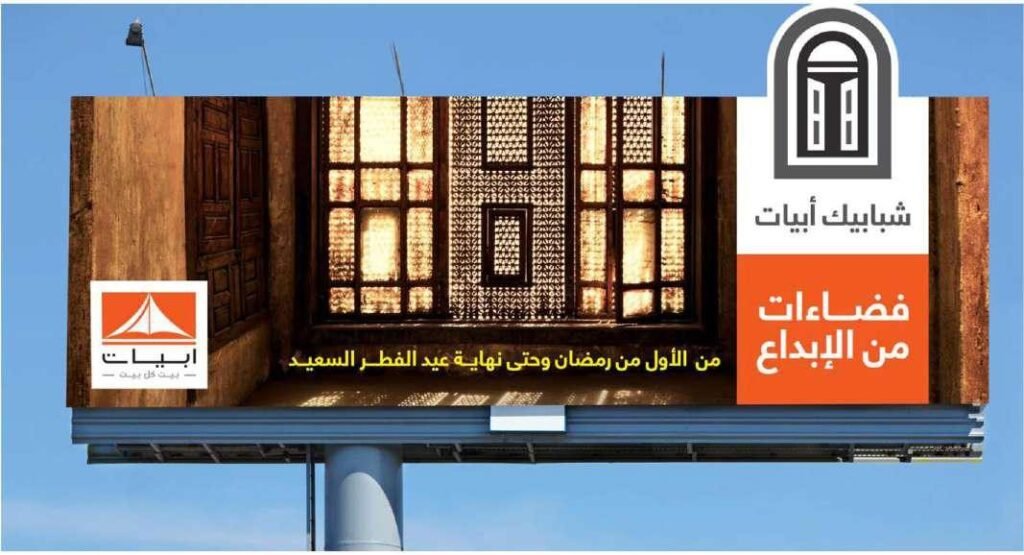
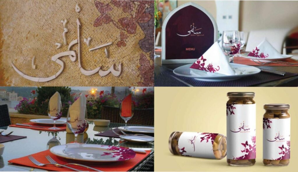
Identities, print and design work we delivered to clients.



Questions About Event Branding
What hosts and organisers ask before they brief the look of an event.
What is event branding?
It is the identity of an event rather than of the company that hosts it: a name, a logo or lockup, colours, typefaces, a key visual and the rules for applying them. It covers every piece guests see, from the save the date to the signs, the stage and the report sent after the event.
How is it different from our company identity?
Your company brand is permanent and covers everything you do. An event's look serves one event or a series, carries a date, has to make room for sponsors and partners, and is applied to temporary pieces such as badges, backdrops and signs. It sits under your brand and follows its rules where they apply.
Does every event need its own logo?
No. A conference, forum, award or festival that will return usually does. A launch or an internal gathering is often better served by a lockup of the event name with your logo, plus a key visual, which keeps the event clearly yours.
How do you handle the Arabic and English versions?
Both are drawn together from the start, with typefaces chosen as a pair. We prepare lockups with Arabic leading and with English leading, in horizontal and stacked forms, so each piece uses the version that fits its layout and its audience.
How are sponsor logos placed?
Through tiers agreed before the sponsorship file is sent: each tier has a size, a clear space and a position on the sponsor wall, the screens and the print. Sponsors send vector files by a closing date and approve their placement before anything is printed.
What is in the identity guide?
The logo versions and the space around them, the colours with print and screen codes, the typefaces, the key visual and how it crops, the icons, the sponsor rules and examples of correct and incorrect use. It goes to the venue and every supplier with the source files.
Can the identity be used again next year?
Yes, if it is drawn for that. The name, mark, colours and icons stay, the year and the key visual change, and signs and stands can be built so that only those panels are replaced. The kit can be kept in our storage between editions.
How do you make signage accessible?
Strong contrast between text and background, clear typefaces sized for the distance they are read from, matt surfaces that do not glare, icons beside words, and signs placed where a person in a wheelchair and a person standing in a crowd can both see them. Directions never rely on colour alone.
How many approval rounds are there?
The number is agreed in the quote, together with the name of the person who signs off each stage. Gathering every department's comments into a single list per round keeps the rounds few and the dates safe, because printing cannot start until the files are approved.
Where is the work produced, and how do we start?
We have more than one location in the Kingdom, and every printed, acrylic or built piece of your event is produced in our own factory and installed by our own team. Send the event type, date and venue on WhatsApp at 0567069088 or through the quote page, and an itemised quote follows within 24 hours.
A Look of Its Own for Your Next Event?
Send the event, its date and venue and what you already have from your brand. Within 24 hours you have an itemised quote that names the design work, every application and every piece of signage.
More specific pages on this
If your question is narrower than this page, these are written for one question each.

